History of the Adidas Logo
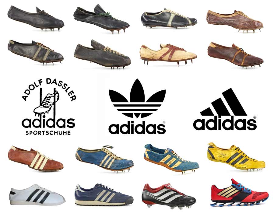
While many of the world’s top brands sport a thoughtful and often philosophical approach to their logo designs, the story of Adidas is quite different. Born of sheer pragmatism and efficiency, while at the same time mired by war, feuding and betrayal, the brand which has become globally synonymous with athletic excellence doesn’t have the sort of case study one might expect.
Humble Beginnings
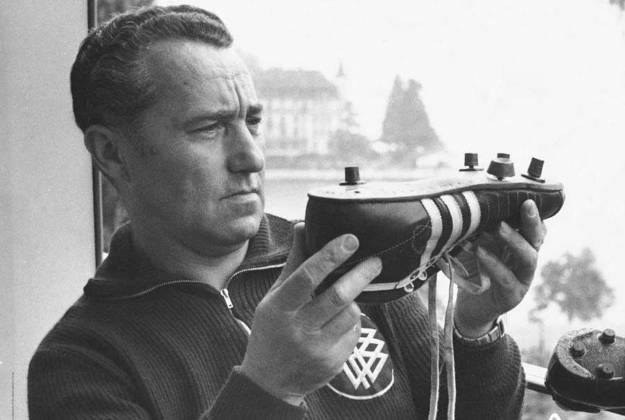
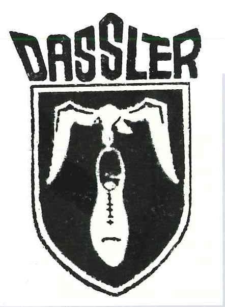
Adi Dassler first began to fashion sports shoes in his mother’s laundry room after returning from World War 1. A true sports fanatic, the youth was constantly tinkering and tweaking his shoe designs for optimal performance, a driving force which would earn him instant recognition and immediate demand for his products. So he launched the Dassler Brothers Shoe Factory in which his brother Rudolf would play a critical role. The three stripes weren’t even a glimmer in his eye yet. This was the company’s logo:
The Rise
Starting with tennis shoes and branching out into other sports, the industrious pair worked diligently to earn high profile contracts, eventually gaining worldwide recognition after multiple winners at the 1928 Olympic Games competed wearing their shoes. From that point on, there was nowhere to go but up and the company expanded to meet a rapidly growing demand. The Olympic games would continue to play a central role in their marketing initiatives, as more and more athletes took home medals sporting the company’s increasingly famous footwear.
A Feud Begins
With the 1930’s well underway both brothers joined the Nazi party. Rudolf was the more zealous of the two however, and the brothers would find themselves at odds more and more as the new regime grew in power. Rudolf was subsequently drafted in World War 2, while Adi would stay behind and produce shoes for the military. Eventually he would break from the Nazi party, further alienating his brother, who soon found himself captured by Americans. Details are sketchy as to the source of their dischord, but for whatever reason upon Rudolf’s return to Herzogenaurach, the two would never speak to each other again. The company was split into separate entities and the brothers parted ways for good.
Three Stripes
Realizing that he had serious competition, in his own town no less, Adi launched his own venture in 1951, dubbing it “Adidas” - a combination of his nickname and half of his surname. All he needed was a trademarked logo which he was more than happy to purchase from finnish sportswear label Karhu for today’s equivalent of $1800 and two bottles of whiskey. He managed to do so just in the nick of time it seems, for most people today have no idea that the iconic stripes once adorned a completely different brand.
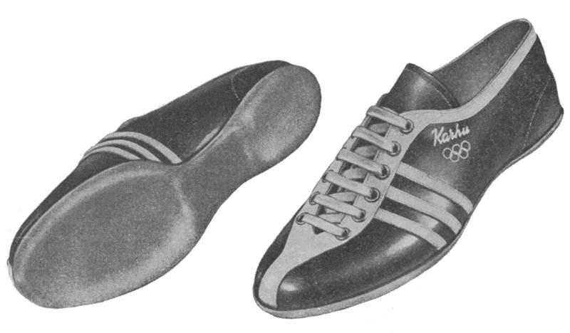
Despite its simplicity, or perhaps because of it, Adi knew that this linear design would play the perfect protagonist for that valuable bit of advertising real estate on the sides of the shoes. This is where the logo would live in its current form. For all print/marketing purposes, a custom eblem was created using the familiar ITC Avant Garde Gothic font which has always represented the company’s clean, almost spartan aesthetic.
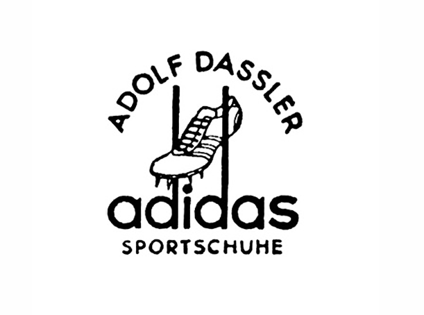
The three stripes are implied utilizing extended stems of the “d” s themselves to interact with an illustration of a shoe and Adi’s name crowning the emblem in a semi-circle. He was so completely sold on the shoe’s new brand that he often referred to his venture as the “Three Stripe Company”.
War & Cleats
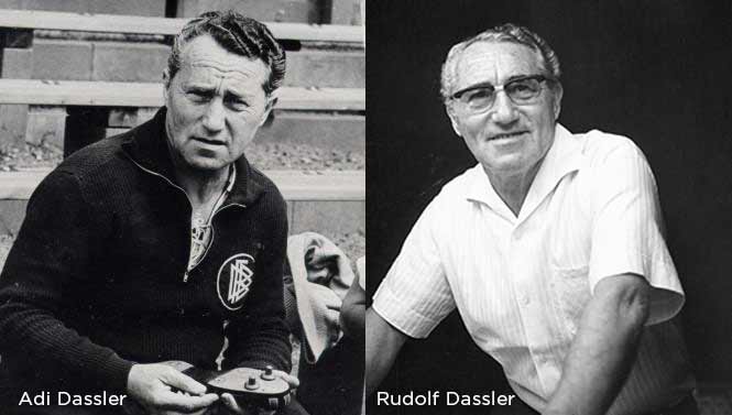
On the other side of town Rudolf was also hard at work on his own footwear company. At first he followed Adi’s lead and tried to incorporate his name into the brand as “Ruda”, but this idea was quickly abandoned in favor of “Puma”, which you can read more about in History of the Puma Logo.
As both companies progressed, the family rivalry between the Dassler brothers reached a fever pitch. Some might even say it was this fire of competition that would forge both brands as major players in one of the most competitive fields. There were consequences however, as workers from both factories carried their rivalry outside the workplace. In many cases they were not permitted to mingle. This rift would not only change the face of the footwear industry, it would permeate the social fabric of the town for many years - a phenomenon explored in depth by Barbara Smit in her book “Sneaker Wars: The Enemy Brothers Who Founded Adidas and Puma and the Family Feud That Forever Changed the Business of Sport”
The Trefoil
With both brands seeking their respective footholds, Adi decided to up the ante in 1971, expanding into mainstream markets for leisure and casual wear. As part of this branching initiative, a trefoil logo was created. The icon was built from three radiating leaves with the now-ubiquitous three stripes running through the lower half of the emblem. They were a visual symbol of the company’s aspirations for growth in a rapidly shifting market.

The logo worked out so well, that it began to make appearances on their athletic products, raising the bar for their brand on pitches and in stadiums around the world. In many ways it’s the logo that helped catapult them into mainstream success. The trefoil was an integral part of popularizing the shell-toe Superstar editions, which would earn global infamy from Run DMC in their classic song “My Adidas”, a fashion statement with a its own history. This bridge into urban culture was the final one to cross for the brand, earning it a far bigger market share in America than before and securing its place as one of the world’s top sportswear brands.
Adidas Equipment aka “Three Bars”
Having established itself as a household name, the company sought out a new look in 1997 to accentuate its high performance line of products. For this design the three bars were staggered vertically then rotated 30 degrees, giving the overall impression of a mountain. This was an intentional design feature meant to highlight the company’s dedication towards helping people achieve more challenging feats with superior comfort and performance.
Much like its predecessor, this logo would enjoy widespread success, eventually beocoming the adopted standard across all apparel. The trefoil logo was relegated to the heritage line of products which continue to enjoy success to this day.
The Wordmark
In 2005 the company boiled down the logo to its most minimal incarnation to date - a simple wordmark in the classic font with the three bars placed horizontally alongside. Anyone who has bought a pair of Adidas in the last decade will no doubt recognize this logo from the branded packaging and boxes their products are sold in.

It proved itself to be a versatile design element, helping to further propagate the empire that Adi built. By this point Adidas had merged all its children companies into a conglomerate (The Adidas Group) which would become the umbrella company for other big names like Reebok and TaylorMade. The logo has the symbolic gravitas of a company which makes a tremendous effort to expand and stay current, without losing the connection to its roots.
The Truce
While the feud between the Dassler brothers would endure long after they both passed on, it would eventually fizzle out once the enterprise went public and family ownership was no longer an issue. The beef was officially squashed in September of 2009. In commemoration of UN’s World Peace Day, Puma CEO Jochen Zeitz decided to call Adidas CEO Herbert Hainer and organize a spirited, yet friendly soccer match. The game was a close one at 7-5 although each team was comprised of employees of both companies, to drive home the message of solidarity and peace.
Looking Forward
With a truce formally declared both companies continue to rival each other in the professional sphere as they always have. Except now they can drive each other towards innovation and success, unencumbered by bad blood and fueled only by the sport of friendly competition which has always unified their respective purposes. While we remain certain that Adidas will continue to reinvent itself there remains little doubt as to whether they will ever stray from the minimal essence of a brand that Just Works™.
Fine Print Art is an educational independent research publication. The above content has not been officially sponsored by Adidas Group.