Fine Print Art aims to inspire your imagination and spark your creativity.
We focus on branding, graphic design, illudtration, painting, drawing, sculpting and architecture.
History of the Rolex Logo
Posted onApril 24th 2019
Long before Rolex became a world standard for luxury time pieces, it was just an idea swirling in the head of 24 year old Hans Wilsdorf. The year was 1905, and at the time wrist watches were accessories commonly worn by women or military personnel, while most men carried pocket watches. Hans had a different vision when he started Wilsdorf & Davis - a joint venture in London with his brother-in-law Alfred Davis - establishing a base of operations and a partnership with Swiss watchmaking company Hermann Aegler to start selling their first watches.
 ## 1908: Origin of the Rolex Name
Three years later, business was booming for “W&D” watches - a success that inspired Wilsdorf to revisit the brand name. Many people have speculated on his inspiration. Some believe it is derived from the french expression “Houloguorie Exquise” which means “exquisite watchmaking”. Others believed that it was chosen because it phonetically sounds like a watch being wound.
The truth was far more practical than most might imagine. Wilsdorf was simply in search of a name that was short, easy to say, easy to spell, easy to remember in any language, and most importantly of all - looked good on his impeccably crafted watch faces.
This is except from his autobiography:
“I tried combining the letters of the alphabet in every possible way. This gave some hundred names, but none of them felt quite right. It was one morning when I was sitting on the upper level of a double-decker powered at that time by horses, driving along Cheapside in London, that a good genie whispered in my ear: “Rolex.” A few days after this fruitful journey, the Rolex brand was filed, and then officially registered in Switzerland.”

An early Rolex banner advertisement featuring the original Wilsdorf and Davis brand.
Initially the company didn’t have a fully developed brand, opting for a Garamond-like bold serif typeface to highlihgt the name in their printed advertisements. Even in its crude form, the genius of the name is revealed in its near-perfect symmetry that would serve the company well for many years.
1952: The Coronation
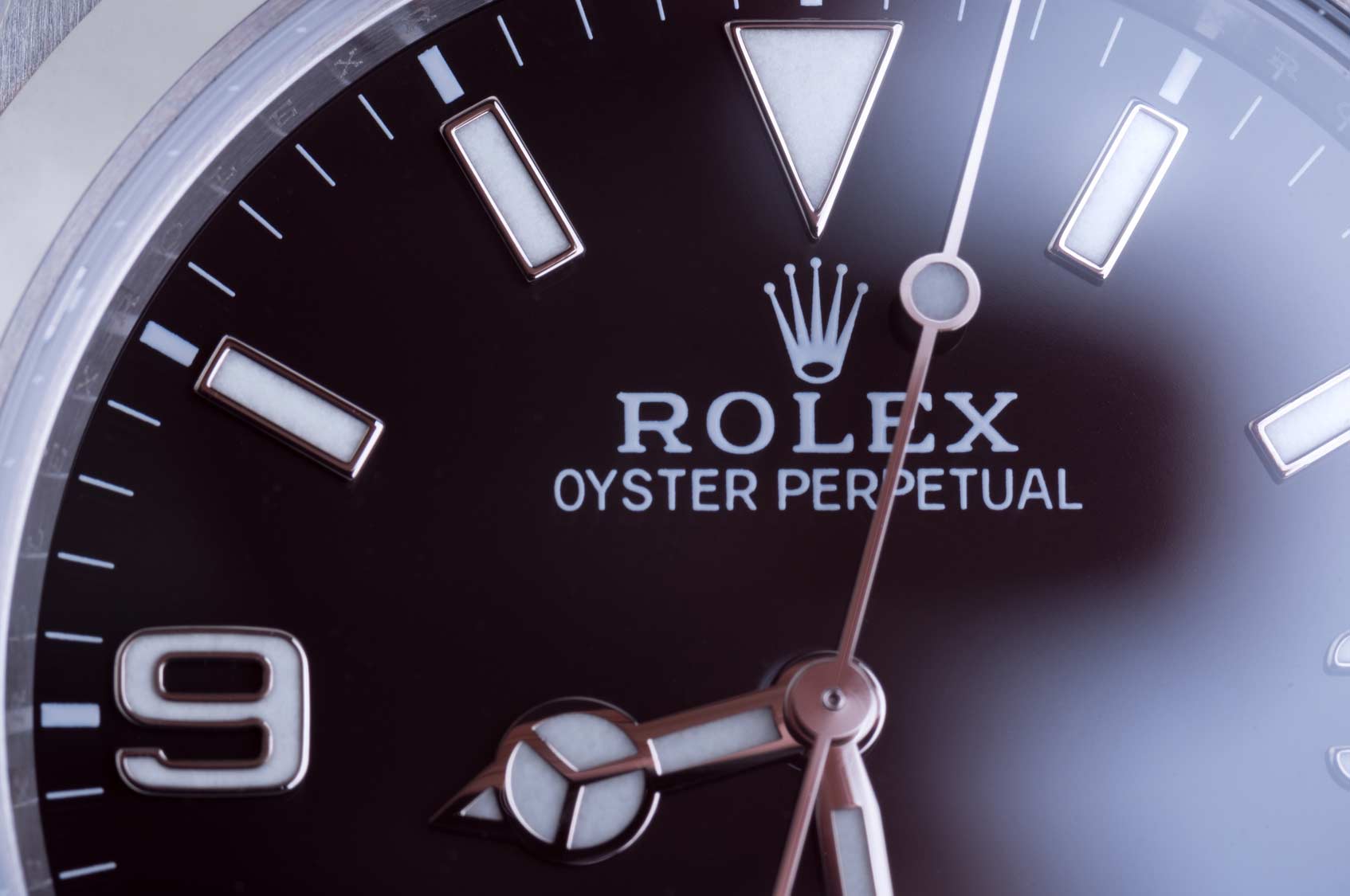
The revision of the font to a more refined and squared off serif is a minor change in light of the five-pointed crown icon, rendered in a muted gold tone that was roundly offset by the dusky blue lettering. This particular choice of iconography was added to compliment the company’s slogan “A crown for every achievement”.

The addition of the crown also provided the subconscious establishment of Rolex as the king of watchmakers - a reputation that would not be taken lightly by the company or its growing multitude of loyal customers.
Innovation, Accolades & Evolution
Over the next few decades, Rolex would go on to revolutionize the industry on multiple occasions. From waterproof watches and the addition of date-keeping to perpetual self-winding mechanisms, the company never stopped raising the bar or thinking outside the box. It also became a hallmark of many ambitious adventures, such as the first expedition to Mount Everest or the breaking of multiple speed records on land, sea and air.
All of these factors helped cultivate the Rolex image, not just as something fancy or shiny, but a feat of engineering and quality, suitable for the biggest risk-takers. Far beyond a status symbol, Rolex came to stand for for great achievements.
2002: Rolex Rebrands
Exactly 50 years after the first crown logo and almost a full century since the company’s inception, Rolex decided to give its logo a style upgrade. Aside from the switch of wordmark color from blue to green, the font weight was tweaked so thinner lines got thinner while the bolder stems got thicker.

Perhaps the most striking change is the right leg of the capital “R” which no longer sweeps upward, firmly planting the wordmark at the baseline and giving it a little more weight and stability.
Today, Rolex continues to set new standards with its products, while reinforcing its position as one of the world’s premier watchmakers.
Fine Print Art is an educational independent research publication. The above content has not been officially sponsored by Rolex, SA.