History of the Amazon Logo

Long before Amazon.com was the world’s one-stop shop for practically every product imaginable, it was just an idea buzzing around the head of 30 year old Jeff Bezos. It was 1994 when the Albuquerque native was making a cross-country drive from New York to Seattle as he sketched up the company’s business plan to build the world’s largest bookstore. A born tinkerer, his background in computer science and engineering would be applied with laser focus once he realized how popular the internet was about to become.
It was an opportune moment, a U.S. Supreme Court ruling had been declared that “mail order catalogs were not required to collect sales taxes in states where they lack a physical presence.” This was a brand new fronteer, ripe with opportunity and Bezos knew it. Fully invested in his vision, he resigned from a lucrative position on Wall Street to boot up the business from his garage.
What’s in a Name?
The company was originally founded as “Cadabra”, an abbreviated version of “Abracadabra on July 5, 1994. Bezos changed the name to Amazon a year later after a lawyer misheard its original name over the phone as as “cadaver”. As a result he would experiment with a number of different names, including MakeItSo.com, Browse.com, Bookmall.com and others.
Frustrated when nothing seemed to stick, Bezos went back to basics by thumbing through a dictionary. He decided that the name should definitely start with an A, and perhaps have a Z in it, to represent the wide range of books he would be selling. He settled on Amazon for meeting this criteria, with the added bonus of being the largest river in the world, by a wide margin at that. This was inline with his vision, to completely surpass competitors by several orders of magnitude.
First Iterations
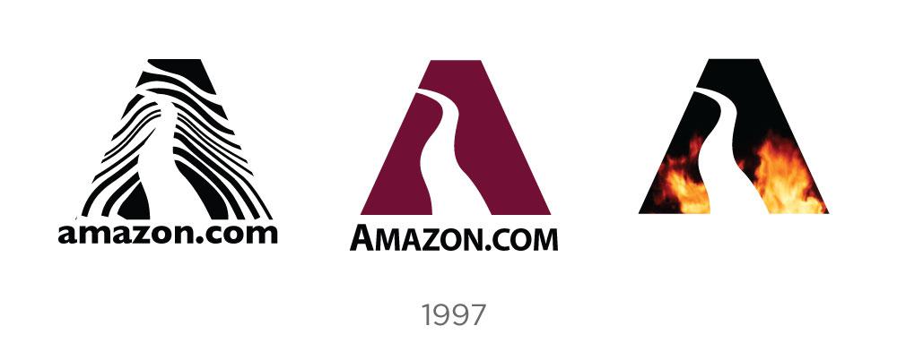
Initial branding attempts were not quite as refined or polished as the emblem we’ve grown accustomed to over the years. The initial prototype featured a giant, bold letter “A” with a winding river cutting through its silhouette and superimposed on an aquatic background. It didn’t win any design awards but it definitely got the company’s momentum to a rolling start.

There would be a number of variations on this theme, each one experimenting with color schemes, icon fills and choices of typography. By 1997 the wordmark had extracted the capital “A” icon. Experimenting with both upper and lowercase, serif and sans the company began to show a glimmer of the iconic palette which has become so representative of this brand.
 ## A New Direction
By 1998, Amazon was growing exponentially. Unlike many competitors growing in the dot-com bubble, Amazon provided a lot of vanguard features out of the box which revolutionaized the industry. It was one of the first e-commerce sites to incorporate one-click shopping and email order verification. It offered unprecedented convenience for shoppers whil also providing a massive, comprehensive stock of books that would eventually dwarf its brick and mortar counterparts around the world.
Given their success in this sphere, the company would extend its model to include an audio library. The music section would debut on Amazon with over 125,000 titles searchable by artist, song title and label. The site would also receive a style reboot, kicking off a radical series of iterations on the logo as the company struggled to create a visual identity as ubiquitous as its rapidly growing services.

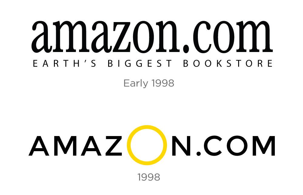
Initial iterations included a lowercase serif logo paired with a book and globe icon. This imagery would become obsolete once the product line would diversify, so changes were made. A sans serif, all-caps wordmark with a large, golden “O” in the middle would last a few months, before morphing into the sans-serif, lowercase font we know so well. Constantly looking towards the future, the company’s ambitions were reflected in its new tagline “Books, Music & More” This logo would remain in place until the company had time to expand on the “More” part of that equation.
The Everything Store
By 2000, the dot-com bubble was at its peak, and Amazon was riding high. Far from complacent with its supremacy in the market, Bezos was constantly looking for ways to expand and improve his business, eventually moving far beyond the realm of consumable media into just about every product imagineable. You don’t make such a huge industrial leap without updating your logo, and this time Jeff wanted to nail it for good - something timeless that would stick with the company moving forward. For this task he turned to creative agency Turner Duckworth who would deliver something definitive and lasting:

The firm was successful in a number of regards here. Firstly the swooping yellow arrow points from the “a” to the “z” of the logo, hitting home Bezos original brainstorm on why Amazon made a good name to begin with. The shape itself has a round-edged, organic quality to it, and the right side actually bends the bottom stem of the “z” upwards, hinting at a smile to represent the stellar customer experience the company had grown famous for. This design element underscores a custom font, which looks quite similar to Officina Sans and opts for a bold face on the “amazon” part of the workmark. The brand proved so effective that it would become recognizeable, even when the company name was omitted in favor of an initial.

Under this timeless brand Amazon remains at the forefront of its industry, continuing to push the envelope for online retail, with everything from ebook readers to delivery via drones and the astonishing automated hub that manages its sprawling and ever-growing inventory of products. This is a company that has never been attached to the status quo and their journey towards progress and innovation lives on their logo and collective ethos which was inspired by the founder all those years ago on the road to Seattle. To quote Bezos directly:
“We are culturally pioneers. We like to disrupt even our own business. Other companies have different cultures and sometimes don’t like to do that. Our job is to bring those industries along.”
Fine Print Art is an educational independent research publication. The above content has not been officially sponsored by Amazon.com, Inc.