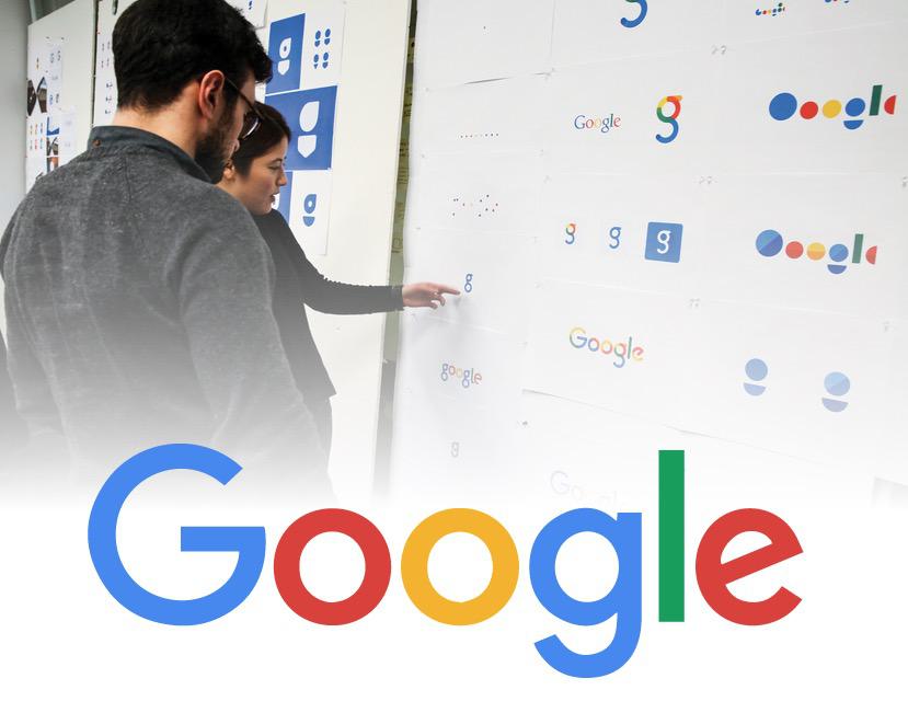
Google Unveils New Logo for Radical Brand Revamp

Today google users were treated to a historic animated doodle which depicts a hand erasing the iconic rainbow serif text and sketching in their brand new, revamped brand. The bold new look announced by Google has a lot of people talking, and given that we’ve posted on this subject extensively we can’t help but comment on the upgrade.
By far, the most obvious modification is the font change. The transition from a serif font to a sans-serif definitely gives the wordmark a much more streamlined and modern look and feel. The font itself is called Product Sans (download here ) and it was custom made by Google. The geometric build of the typeface also provides a more stark, generic edge to the brand presumably to symbolize Google’s bigger reach across multiple industries. But Google isn’t a generic company by any means, and as usual in their playfulness is on full display with the skewed twisted letter “e” at the end. The design team describes their rationale:
“The Google logo has always had a simple, friendly, and approachable style. We wanted to retain these qualities by combining the mathematical purity of geometric forms with the childlike simplicity of schoolbook letter printing. Our new logotype is set in a custom, geometric sans-serif typeface and maintains the multi-colored playfulness and rotated ‘e’ of our previous mark—a reminder that we’ll always be a bit unconventional”
The google doodle showing the transition is an accurate representation of the process. The designers started with four colored dots, distilling their brand to the bare essence before developing a new visual representation.
We started by distilling the essence of our brand down to its core—four colors on a clean white background—and built it back up. Stickies were stuck, pins were pushed, and beziers were animated. With the cutting room floor littered with hundreds of hours of design work, we set out with a few directions that excited us.
The group continued to develop may designs, finally settling on the current version and making a few tweaks to their style guides. For example, the four colors used in the logo vary depending on their proximity. With white space between them they are lighter values. But when sandwiched together the contrast was not quite right, so the team put together a slightly more saturated palette so the colors sat well next to each other.
This is probably the biggest shift in google’s branding since their debut. An incredibly painstaking amount of work went into this transition and you can read all about it, and check out some cool videos demonstrating the process on Google’s design blog.
Industry Pulse: What are people saying about Google’s new logo?
Google’s Logo Killed Serifs Because Serifs Had It Coming
GizmodoGoogle’s New Logo is Trying Really Hard To Look Friendly
WIREDGoogle’s new logo: What it really means
c|netGoogle unveils new logo at turning point in company’s history
The GuardianGoogle’s New Logo Is Its Biggest Update In 16 Years
Fast CompanyGoogle’s New Logo Is Far More Than Just A Digital Doodle
TechCrunch