History of the BMW Logo
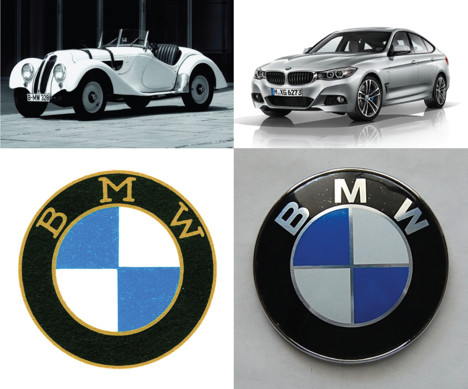
Few automobile logos are as recognizable as BMW (Bayerische Motoren Werke). Whether you compare it to other cars or just about any other brand, it’s a consistent list topper on articles reviewing the most clever and ubiquitous logos of all time. There’s a solid reason for this, given the long and rich history of a global brand, albeit one mired misconception throughout the decades.
A lot of people have postulated that the logo itself was a representation of airplane propellers, perhaps an indication of the quality and power of BMW’s legendary engines. The myth is rooted in the company’s origins as a manufacturer of aircraft engines and was unintentionally perpetuated by BMW in a series of 1929 adverts superimposing the logo over an airplane propeller.
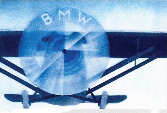
The marketing push stemmed from a newly sealed deal to produce radial aircaft engines for Pratt & Whitney. At the height of a global economic depression, the company sought to boost morale and consumer confidence in a bold series of marketing campaigns. They were so effective that most people defer to them as documentation of the logo’s origins, including people working at BMW! The idea was further reinforced in a 1942 article by Wilhelm Farrenkopf in the BMW journal which used similar imagery - and the propeller legend grew.
But the truth is that BMW’s logo was not inspired by spinning blades against a clear blue sky. In fact, it was born of an ironic need to distance itself from the airline industry. Before it underwent a series of acquisitions and mergers, the company known as BMW existed as Rapp Motorenwerke, an aircraft engine manufacturer. As you can see the logo we all know and love borrowed a good deal of DNA from its predecessor, which was created in October of 1913.

It wouldn’t take too long for Rapp Motorenwerke to be a rap. The endeavor would only last for 4 years thanks to the ravages of World War 1, financial recession and a shift in market focus to satisfy a wildly growing demand for vehicles. In July 1917, founder Franz Josef Popp registered the name Bayerische Motoren Werke (Bavarian Motor Works). Given the vastly different target market a new brand was needed. He had the name, and some experience branding the previous company, so he simply iterated on the old design while representing his colors of national pride.
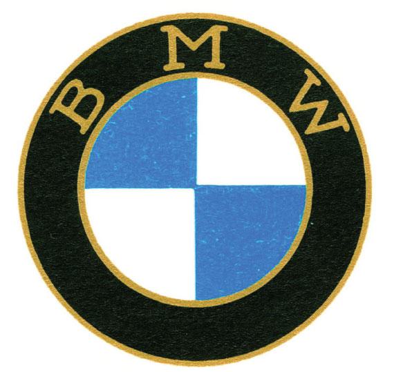
In October of 1917 Popp registered a trademark which would stand the test of time. The use of a roundel (circular icon or logo) and bordering text ties the logos together, while the BMW logo reaches towards the future with stark modernity. The blue and white fields represent the Bavarian flag, although the order is reversed given that it was illegal for anyone to trademark symbols of the state.
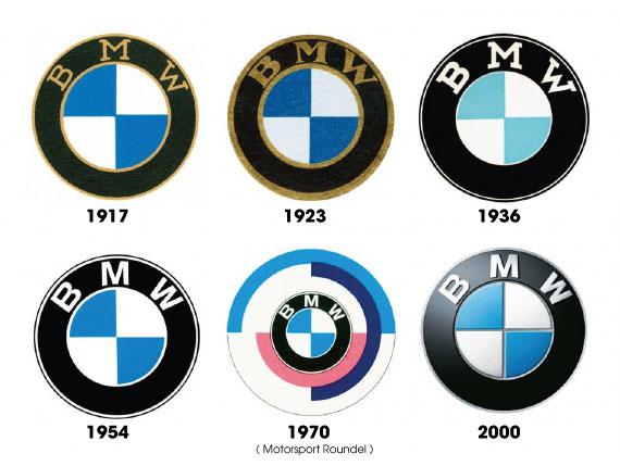
The brand has continued to evolve over the years, although the changes have been minimal given the logo’s iconic simplicity. Border widths fluctuate, gold gives way to white, and the serifs erode into the modern era of sans-serif sophistication, thanks to a custom version of Helvetica Neue Bold authored by Dalton Maag. Aside from these slight modifications, precious little has changed.
All images courtesy of BMW.
Fine Print Art is an educational independent research publication. The above content has not been officially sponsored by BMW Group.
How FinePrintArt.com Maintains Its Ad-Free Creative Platform
FinePrintArt.com is a unique platform developed and maintained by Fine Print New York, experts in the restoration of antique, rare & damaged wallpapers. This collaboration allows this website to offer insightful, ad-free content on creative artists and the evolution of visual branding. Fine Print's expertise in restoring vintage designs directly informs the rich, well-researched articles found here, showcasing our commitment to both historical preservation and contemporary artistic exploration.
Meet the Founders: The Creative Minds Behind Our Platform
Joseph Gornail a distinguished printer/photographer and the visionary behind Fine Print New York, hails from SoHo, Manhattan. Rooted in a family tradition of NYC printing, Joseph mastered the craft as a teenager. His significant impact on the New York printing industry ignited in 1996 with Dolo Records/Stretch Armstrong. He founded All City Marketing & Printing in the late '90s and co-created the iconic streetwear label Orchard Street with partners Benjamin Holloway and Greig Bennett in 1999. In 2004, Joseph launched Fine Print NYC, establishing it as a leading commercial printing firm. The company debuted with a landmark project for Nike, epitomizing innovation and resilience in the modern digital landscape.
Steven Garcia a prominent designer/illustrator and creative director at Fine Print, originates from Bushwick, Brooklyn. A graduate of Fashion Industries High School and the Fashion Institute of Technology (F.I.T.), Steven has carved a notable path in the design world. His early career highlights include a role as a sought-after professional retoucher and storyboard artist at Saatchi & Saatchi in 1996. Embracing his entrepreneurial side, Steven founded ShinyDesign in 1998, which later became a key design partner for Fine Print NYC in 2004. His extensive portfolio features collaborations with elite brands such as Snapple, The Waldorf Astoria, Netflix and Sony, cementing his status as a key influencer in New York's vibrant advertising & design industry.
