History of the Nike Logo
Since 1971 Nike has established itself as the world’s most successful sportswear brand. Its famous “swoosh” is one of the most widely recognized logos, bolstered by ambitious advertising campaigns and endorsements featuring some of the world’s most elite athletes. It’s an impressive legacy for something that was designed by an art student for $35.
The story of Nike begins seven years before its founding by University of Oregon track athlete Philip Knight and his coach Bill Bowerman. In 1964 they opened a store called Blue Ribbon Sports which served as a distributor for Japanese shoemaker Onitsuka Tiger, known today as Asics. A simple logo was designed around the stores’s initials which were composed of parallel lines and interlocked to form a cohesive brand.
Coach Bowerman was on a constant quest to enhance his students’ performance and he began to play around with his own designs. One morning he experienced a breakthrough as his wife made him waffles for breakfast. The waffle iron inspired him to create a similar pattern to increase grip of his shoes and provide greater agility. This was how he developed Nike’s patented “Waffle Trainer” - a pattern which is still used in production today.
With a flagship product in hand, all that was left was to hire some staff and build a new brand. Initially Phil Knight wanted to call their company “Dimension 6”. But this idea was overturned by the company’s first hire, Jeff Johnson who would propose Nike as the official brand name. He was inspired by the winged Greek Goddess, known as the Divine Charioteer, flying above battlefields and giving glory to the victors. The name not only stuck but would become fittingly synonymous with winning.

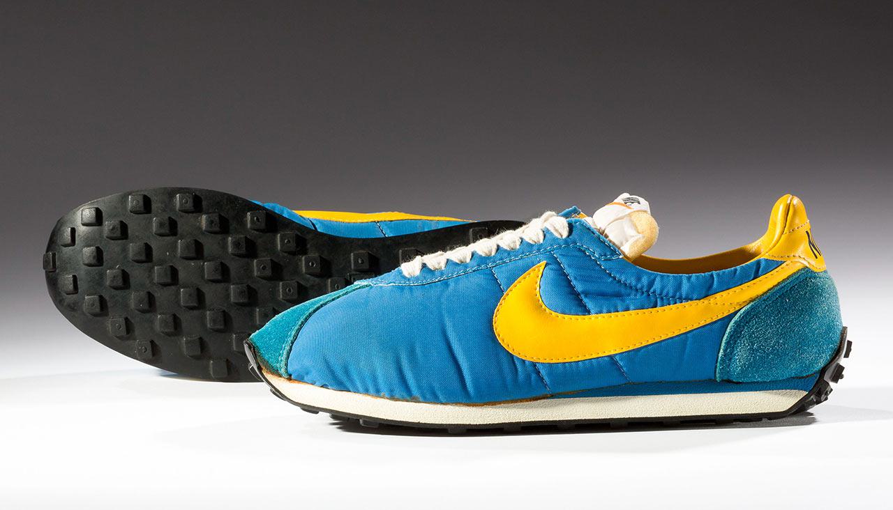
In 1971 Phil Knight was teaching accounting classes at Portland State University when he met aspiring artist Carolyn Davidson. At the time she was trying to earn some extra money to pay for oil painting classes, so he offered her freelance work to assist in designing a logo. Knight had a clear idea that he wanted a stripe of sorts, something recognizable that could compete with Adidas and Puma but still carry its own identity.
17 hours later, Carolyn submitted a dozen different prototypes. One of them was the mythical swoosh - it was bold and dynamic, a simple representation of movement and grace that would end up defining the brand for decades to come. She accompanied the icon with an unassuming, lowercase script wordmark.
Despite it’s inevitable success, reception was reportedly lukewarm and the logo was chosen due to time constraints. Phil Knight was quoted as saying, “Well, I don’t love it, but it will grow on me.” The brand was now ready to be mass produced.
Perhaps it was the shoes, the brand, or the bright orange packaging which was purposely selected to attract customers, but whatever the case, Nike became a runaway success which could barely keep up with customer demand. There was just one problem. People were having issues with the script font, thinking that it spelled out “Mike” or “Like”. Such a lapse of clarity was unacceptable, which is why the logo was revisited in 1978 by Art Director Denny Strickland of Brown Advertising Agency.
Strickland went in the complete opposite direction in his choice of a sans-serif font, spelling the name out in bold, capital letters. The only remnant of the original wordmark is the 20 degree slant - a visual feature which flows with the swoosh and hints at the movement and performance associated with the brand.
In 1982 Nike would form a long lasting partnership with advertising firm and fellow Oregonians Weiden & Kennedy. Two years later, Nike would sign Michael Jordan to a five-year contract for a reported $2.5 million, sparking off one of the most successful celebrity endorsements of all time and solidifying Nike as a brand for elite athletes. The “Air Jordan” campaign spearheaded a whole new brand, featuring a silhouette of Michael Jordan, basketball in an outstretched hand, poised for victory.
The following year, Weiden & Kennedy put a subtle spin on the logo, placing it inside a rectangular box and inverting the design. It was inspired by Coca Cola’s “Arden Square” logo which created a similar profile for the global brand.
By 1995, Nike had become such a household name that they would make the bold move of omitting the wordmark entirely, opting for the swoosh as their official logo which has remained unchanged to this day.
In 2016, Co-Founder Phil Knight would go on to write his book “Shoe Dog” about this company’s amazing history and evolution as one of branding’s biggest success stories.
Fine Print Art is an educational independent research publication. The above content has not been officially sponsored by Nike Inc.