Evolution of Coca-Cola: Iconic Logo's Journey Through History
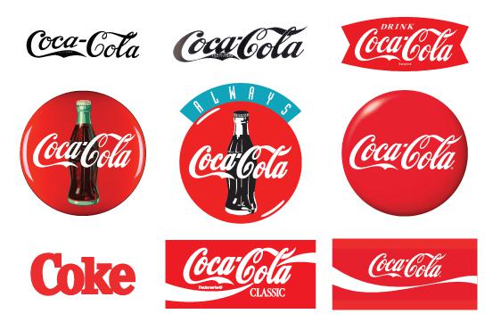
The Coca-Cola Company has earned the distinctive privilege of owning what is probably the world’s most widely recognized brand. In fact, 94% of the world’s population can identify the Coca-Cola logo—a staggering level of recognition that puts it ahead of virtually every other symbol on Earth. Whether written in a serif font, script, or a completely different language, there is no mistaking the look and feel of that logo. While it has morphed into various iterations throughout its lifetime, there is a classic quality to this brand that has never gone away — a timeless trait that has no doubt helped the company build the global brand recognized by billions today.
Surprisingly, this consistency was not the result of some ambitious, long-term marketing plan; but rather a mix of fortunate decisions and a healthy dose of creativity from some unexpected sources.
The Origins: Creativity in Unexpected Places
The story of this famous logo begins in Atlanta, Georgia. John Pemberton, a pharmacist, had just perfected the final recipe for his soft drink in his backyard. Unsure of what to call the new concoction, Pemberton found himself in a bit of a jam. After all, a name can make or break a brand, and he wanted to get it right.
Had he created the formula today, Pemberton might have hired an ad agency or design studio to brainstorm concepts. But since this was the 1880s—a prolific age for “do-it-yourselfers” — he turned to a less likely source of inspiration: his bookkeeper, Frank Mason Robinson.
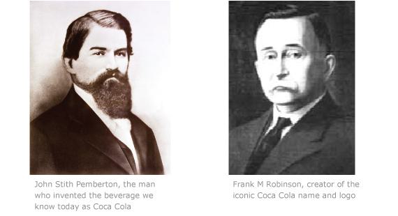
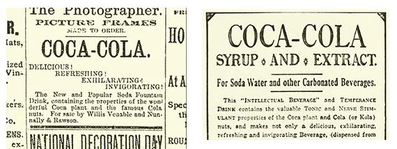
Yes, it’s true: the world’s most famous brand name was not created by a designer or think tank, but by a bookkeeper with a small printing press and a natural talent for marketing. “Coca-Cola” was the first and only name he proposed, stating, “the two C’s would look well in advertising.” Pemberton immediately liked the sound of it. In 1886, they used this name to advertise the beverage in local newspapers. At this point, no formal logo existed, so they opted for a simple and unassuming serif font.
However, Robinson’s vision didn’t stop at the name. Even before the formal script logo was born, Robinson was thinking about how the name would be visually represented, planting the seeds of brand consistency that would later become a hallmark of Coca-Cola’s identity.
Robinson wasn’t just a bookkeeper - he and partner David Doe came to Atlanta in 1885 to sell a “chromatic printing device” that could produce two colors in one imprint. This printing expertise directly influenced his logo design capabilities.
1887-1893: Birth of the Famous Script
Fast forward one year later, and Coca-Cola was enjoying exponential popularity—not just in Georgia, but throughout the nation. The time had come to build a proper logo for the brand. Once again, Pemberton turned to his trusted bookkeeper. As it turns out, Robinson’s excellent penmanship skills would pay off in the form of the now-iconic script logo we all recognize today.
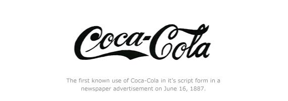
For all intents and purposes, Robinson was a bean-counter with no formal design training. But his calligraphy was impeccable. Robinson’s script conveyed sophistication and luxury, qualities that Coca-Cola wanted to associate with the beverage. While Robinson wasn’t a professional designer, his flair for visual branding was already evident. He believed that the logo should not just identify the product but also evoke a certain prestige and appeal.
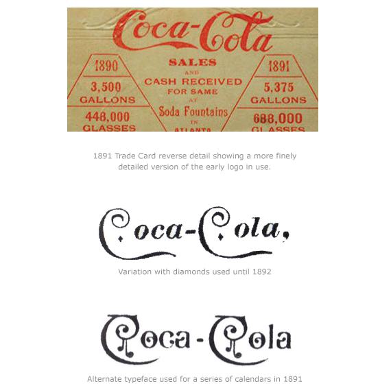
Despite its increasing visibility, Coca-Cola had not yet registered its trademark with the patent office. The logo’s early years saw a number of artists recreating it by hand, which led to slight variations in style. Unlike today’s digital reproduction tools, each version of the logo was a unique piece of craftsmanship, lending the brand a mildly inconsistent, yet charming look.
This period was a fascinating chapter in Coca-Cola’s history, as it reveals the struggles and improvisations of branding in the late 1800s. No matter how primitive the tools, one thing remained constant: the company’s commitment to maintaining a recognizable and distinguished brand, even if it meant commissioning multiple hand-drawn renditions.
Coca Cola Red
Robinson’s choice of red and white wasn’t arbitrary—it was a calculated decision that would prove to be one of the most successful color combinations in commercial history. From the very first advertisements in 1887, Robinson wrote “Coca-Cola Delicious and Refreshing” in red lettering against white backgrounds, understanding intuitively that the high contrast would grab attention in crowded newspaper pages and storefront windows.
What many people don’t realize is that “Coca-Cola Red” doesn’t actually exist as a single, standardized color. Despite decades of speculation and conflicting reports claiming everything from Pantone 485 to PMS 1788 C, Coca-Cola’s own archives are clear: “There is no Pantone color for Coca-Cola red.” Instead, the company maintains its signature hue through a proprietary blend of three different red pigments—a closely guarded formula that has remained consistent for over a century.
This approach to color control was revolutionary for its time and remains unusual even today. Most major brands rely on standardized color systems like Pantone to ensure consistency across different printers and manufacturers. Coca-Cola took the opposite approach, creating their own color standard and requiring anyone working with their brand to use pre-mixed inks supplied directly by the company.
The red disc logo, introduced in the 1940s, further cemented the association between Coca-Cola and this specific shade of red. The simple circle with white script became a universal symbol—when you saw that red disc on a storefront window, you knew ice-cold Coca-Cola was available inside. It was, as former Coca-Cola Archivist Ted Ryan explained, “a promise in a way.”
Editor’s Note: We worked with Coca-Cola directly to produce custom labels and stickers for their “Coke Zero” launch in 2005. We discovered firsthand that their red is a proprietary mix of inks that was supplied by the company itself. We were given explicit instructions to not only use this ink exclusively for all the red areas, but to flush our press of any traces of ink residue from our CMYK process.
As commercial printers we were accustomed to strict branding guidelines but Coca Cola presented us with a whole other level of brand consistency - an invaluable experience that helped us to level up our own in-house Color Matching Process
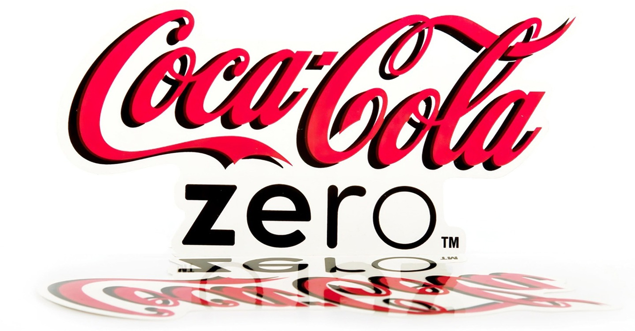
Preview of the Coca Cola Zero Stickers printed by Fine Print NYC
A Marketing Revolution: America’s First Coupon
While Robinson’s logo design would prove revolutionary, it was another of his innovations that would fundamentally change American commerce forever. In 1887, facing the challenge of introducing an unknown beverage to skeptical consumers, Robinson created something that had never existed before: the coupon.
Yes, it’s true: America’s very first coupon was a handwritten ticket offering a free glass of Coca-Cola. At a time when the drink sold for five cents—a significant sum in 1887—Robinson convinced Pemberton to give it away for free. The concept was radical. No American business had ever systematically offered free samples through redeemable certificates.
But Robinson understood something that wouldn’t be formally recognized by marketers for another century: he was solving what we now call the “cold start problem.” Coca-Cola wasn’t just competing against other beverages—it was fighting for shelf space at soda fountains and pharmacies across the nation. Robinson’s coupon strategy was brilliant because it attacked both sides of the equation simultaneously.
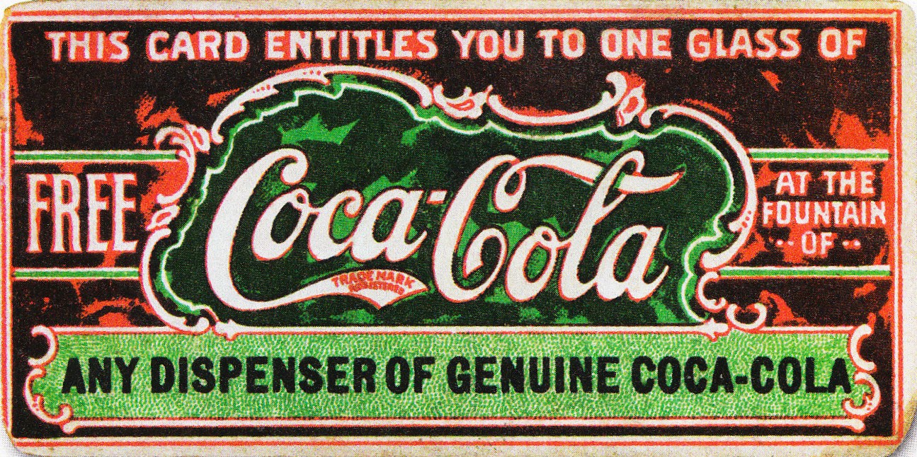
Here’s how it worked: Coca-Cola provided free syrup to retailers to cover the cost of coupon redemptions. Meanwhile, Robinson distributed thousands of coupons through newspapers, magazines, and street teams. When customers arrived with coupons, retailers were already equipped to serve them—and crucially, they were incentivized to do so because Coca-Cola absorbed the cost.
The scale was unprecedented. Between 1894 and 1913, an estimated one in nine Americans—8.5 million people total—redeemed a free Coca-Cola coupon. To put this in perspective, the entire U.S. population was only 60-90 million during this period. Robinson had created America’s first mass sampling campaign, and it worked spectacularly.
The strategy was so effective that Coca-Cola was being sold in every state by 1895, just eight years after the first coupon was distributed. Yet remarkably, no other company attempted to replicate this innovation until 1909, when C.W. Post finally introduced one-cent coupons for Grape Nuts cereal—a full 22 years later.
Robinson had essentially invented modern consumer marketing, complete with supply chain coordination, mass distribution, and performance tracking. The fact that it took over two decades for competitors to catch on speaks to how far ahead of his time this bookkeeper-turned-marketing-genius really was.
Editor’s Note: The coupon innovation showcases Robinson’s understanding of integrated marketing long before that term existed. As a printing professional, I recognize the technical challenge this represented in 1887 - mass-producing consistent, trackable coupons required serious printing infrastructure and logistics systems.
The fact that no other company attempted couponing for 22 years afterward shows how ahead of his time Robinson was. This wasn’t just creativity - it was systematic thinking about how to build a distribution network and create consumer behavior patterns that would last for generations.
1893-1904: Making It Official
On January 31, 1893, Coca-Cola was granted its first trademark from the U.S. Patent Office. From that day forward, the logo would feature the words “TRADE MARK” beneath it. This was a crucial moment in the company’s history, signaling the beginning of Coca-Cola’s journey toward becoming a legally protected brand.
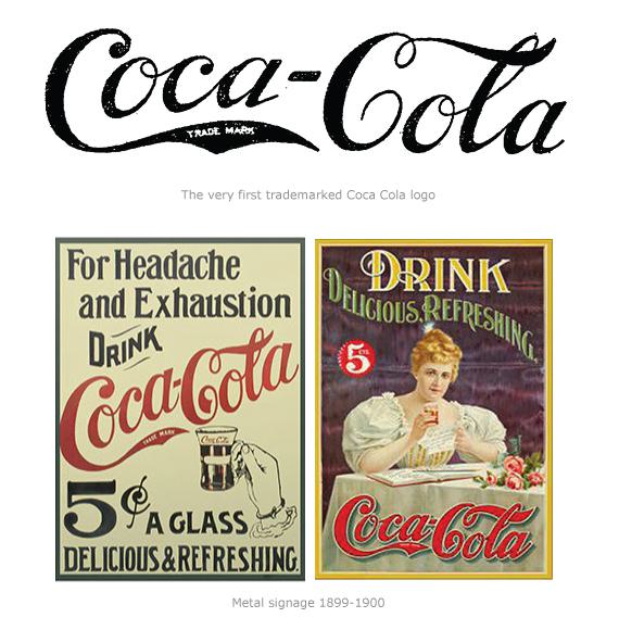
By the early 1900s, Robinson had become increasingly aware of the importance of protecting Coca-Cola’s brand identity. As the company’s success grew, so did the number of imitators looking to capitalize on its popularity by using similar branding tactics. Robinson spent considerable time researching trademark laws, understanding that securing Coca-Cola’s logo under federal protection was essential for maintaining control over its use.
This foresight led to the company filing for a trademark, which was officially granted on January 31, 1893. Coca-Cola continued to refine its branding strategy, and in 1903, when new laws required companies to re-register their trademarks, Robinson and the Coca-Cola leadership ensured compliance. These legal steps not only solidified the company’s position but also helped prevent copycats from diluting the brand’s image in an increasingly competitive market.
This move was a turning point, marking Coca-Cola’s transition from a regional sensation to a national powerhouse. It was also the first of many steps toward cementing its global dominance. With the legal protections in place, Coca-Cola began rolling out its branding on everything from soda fountains to glass bottles, ensuring that the logo was seen everywhere—and by everyone.
1903-1941: “Trademark Registered”
In 1903, a new law required companies to re-register their trademarks, leading Coca-Cola to modify its logo once again. This time, the words “TRADE MARK REGISTERED” began to appear within the swooping tail of the letter “C.” The change, though subtle, underscored the brand’s commitment to staying current with legal requirements while refining its identity.
During the mid-1920s, the word “DRINK” was added above the logo on signage and in advertisements. This small addition helped align Coca-Cola’s brand with a growing consumer culture, encouraging people not just to recognize the logo but to engage with the product itself.
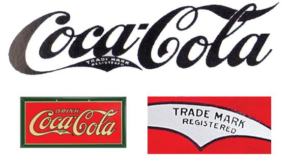
This era marked the beginning of Coca-Cola’s expansion beyond the U.S. borders. By the 1920s, Coca-Cola was being bottled in Europe, South America, and even parts of Asia. Each market presented unique challenges for maintaining brand consistency, but the groundwork laid by Robinson’s unified logo vision helped the company navigate these waters.
The iconic script logo, first designed in 1887, became a key element in ensuring that the brand was instantly recognizable, no matter where it was sold. While Robinson was no longer directly involved by this time, his early contributions to Coca-Cola’s brand identity continued to play a pivotal role as the company grew into a global phenomenon.
1941-1962: REG. U.S. PAT. OFF.
In 1941, Coca-Cola shifted the trademark notification from the tail of the “C” and centered it underneath the words “Coca-Cola.” The phrase “REG. U.S. PAT. OFF.” appeared in most instances, though slight variations existed depending on where and how the logo was used.
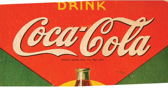
This period also coincided with Coca-Cola’s role during World War II. Coca-Cola was one of the few American companies allowed to continue production during the war, and it was shipped to soldiers overseas. In fact, Coca-Cola provided over 5 billion bottles to the U.S. military, an initiative that further solidified the brand’s association with American values and patriotism.
As American soldiers traveled across Europe and the Pacific, so too did the Coca-Cola logo. For many foreign consumers, this was their first encounter with the brand. The logo became a symbol of America itself, a reputation that persists in certain parts of the world to this day.
The U.S. government considered Coca-Cola essential for troop morale and allowed it to continue production despite rationing of key ingredients like sugar. Additionally, Coca-Cola’s international expansion efforts during this time were bolstered by the construction of bottling plants in various locations around the world, which later helped the company establish a global presence post-war.
1950s: Simplified Trademark Information
Beginning in the early 1950s, Coca-Cola began simplifying its trademark designation. “Trade-mark ®” became the standard across most items, replacing the more cumbersome “REG. U.S. PAT. OFF.” This reflected a broader trend in the company’s branding strategy: streamlining its visuals to keep up with modern design trends without losing the timeless quality of the original script.
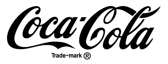
This era also saw the logo being placed inside a red circle with a portrait of the now-iconic Coke bottle behind it. This visual treatment became a common motif in ’50s-style diners, where Coca-Cola was already being celebrated as a symbol of American culture and nostalgia.
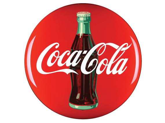
In a post-war America that was experiencing rapid cultural shifts, Coca-Cola’s logo remained a comforting and familiar sight. By adapting to the design trends of the 1950s, Coca-Cola managed to stay relevant while maintaining its brand identity—a delicate balance that few companies could achieve as successfully.
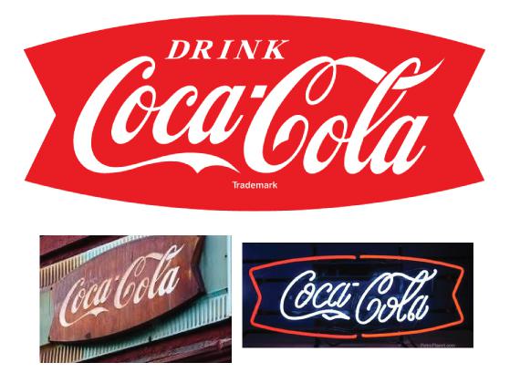
1958 The Fishtail Logo
The “fishtail” logo, officially known as the Arciform shape, was introduced in 1958. This design placed the famous Coca-Cola script inside a bold, horizontal arc that resembled a fishtail, giving the brand a fresh, eye-catching look. It was an era when the company wanted to emphasize Coca-Cola’s role as part of everyday American life, and the new signage helped to achieve that goal. The fishtail logo was prominently displayed in restaurants, diners, and soda fountains, quickly becoming a symbol of social gathering spaces.
In fact, many businesses proudly placed metal signs featuring the fishtail logo outside their stores to draw attention and traffic. This became a popular sight in roadside eateries and corner stores across the country, solidifying Coca-Cola’s association with good times and hospitality. Although the logo was eventually retired, the fishtail remains an iconic piece of Coca-Cola’s visual history.
1969-1985 Catch the Wave
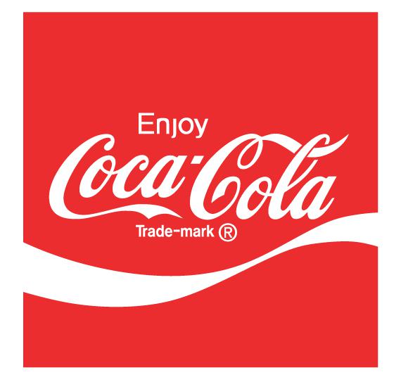
As Coca-Cola continued to grow globally in the late 1960s, the company felt it was time to modernize its branding to appeal to a more dynamic, youthful audience. In 1969, Coca-Cola introduced a new logo featuring a red square with the familiar script, accompanied by what would become known as the Dynamic Ribbon device. This “ribbon” was meant to represent the refreshing flow of the beverage and was designed to evoke energy and movement, traits that aligned with the cultural shifts of the time.
The word “Drink” was replaced with the more engaging “Enjoy” to promote a sense of joy and leisure. The Dynamic Ribbon would become a permanent part of Coca-Cola’s brand identity and is still in use today, representing the brand’s consistency and vibrancy across generations.
1985-1987 New Coke
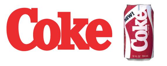
By the 1980s, Coca-Cola faced one of its greatest challenges yet: Pepsi had surpassed it in market share, and the iconic soft drink was no longer the top choice for American consumers. In a controversial decision, Coca-Cola changed its formula and rebranded its product as “New Coke.” Along with this drastic change came a new logo, replacing the script with a thick slab-serif font that was more modern and bold. The rebrand emphasized a clean, contemporary look that symbolized Coca-Cola’s attempt to redefine itself in a shifting market.
However, the reaction from consumers was overwhelmingly negative. The new formula was rejected by loyal Coca-Cola drinkers, sparking widespread protests and boycotts. Despite its modern look, “New Coke” was seen as an affront to tradition, and the company had no choice but to backtrack.
1987 Back to Classic
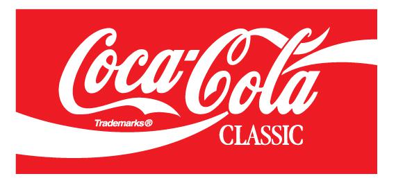
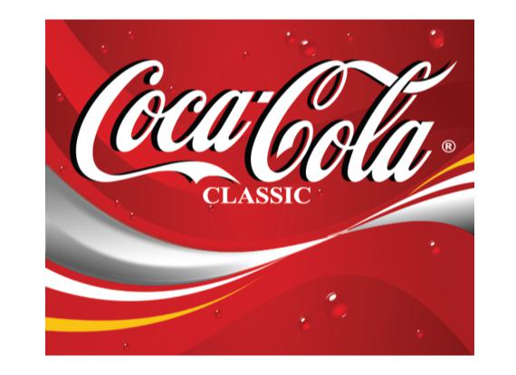
In response to the backlash, Coca-Cola brought back the original formula under the name “Coca-Cola Classic” in 1987. The logo was also restored to its familiar script, with a few modern updates. The word “Classic” was added beneath the logo, and the Dynamic Ribbon was more integrated into the script, weaving through the letters to create a sense of flow and continuity. The design changes allowed Coca-Cola to acknowledge its history while still presenting a fresh and modern face to the world.
This move not only calmed the storm of discontent but also became a turning point for Coca-Cola, reinforcing its heritage as a symbol of American culture. The company learned from this period that nostalgia and brand loyalty were critical to its success.
1993-2002 Always Coca-Cola
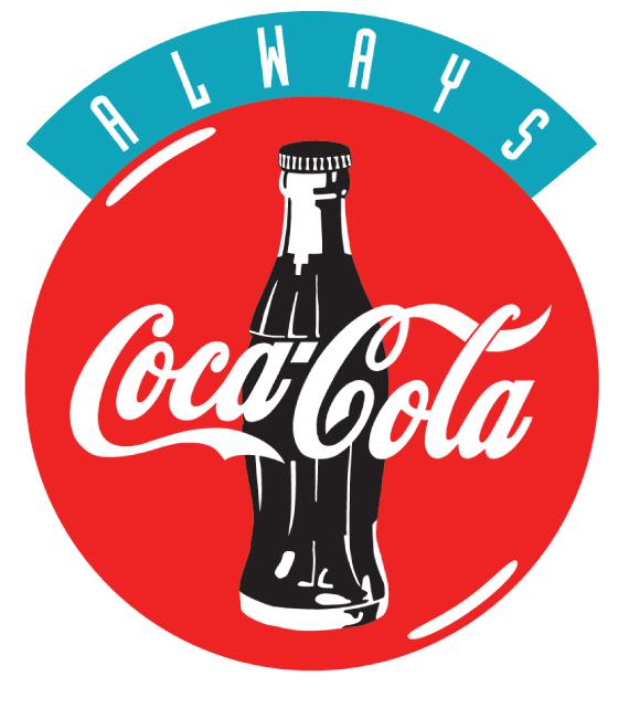
In the early 1990s, Coca-Cola leaned into nostalgia and sentimentality with the “Always Coca-Cola” campaign, which was launched alongside their famous Polar Bear Christmas ads. The logo returned to the circular format with a bottle image in the background, harking back to the 1950s design. However, the phrase “ALWAYS” was added in an arc above the logo, reinforcing the idea that Coca-Cola was timeless and always there for its consumers.
This period marked an era of strong advertising for Coca-Cola, with the Polar Bear and Santa Claus becoming annual symbols of the holiday season. The company’s branding during this time strengthened its association with family traditions and celebrations.
2002-2007 The Dynamic Ribbon Evolves
In 2002, Coca-Cola refined its Dynamic Ribbon device. The logo now featured multiple ribbons of varying transparencies, giving it a sense of movement and vibrancy. A bold yellow ribbon was added, breaking away from the traditional red and white color scheme. This new version of the logo was primarily used in marketing materials and packaging in different regions, reflecting the brand’s adaptability to different markets and audiences.
The introduction of this ribbon also coincided with Coca-Cola’s sponsorship of major global events like the FIFA World Cup, where the updated logo appeared across merchandise and advertisements, reinforcing the brand’s international reach.
2007 - Present: A Return to Simplicity
In 2007, Coca-Cola once again re-embraced simplicity by stripping back most of the additional design elements to focus on the classic script and the iconic red color. The brand adopted a stark, minimal version of the classic logo, removing slogans, extra graphics, and even the Coke bottle, which had been part of many previous iterations. This minimalist approach allowed the script and the color to shine, reinforcing the power of Coca-Cola’s core visual identity.
This modern version of the logo was used in corporate and retail advertising, signaling Coca-Cola’s confidence in the enduring strength of its iconic brand. By focusing on the essentials, the company ensured that the logo would remain timeless, just like the beverage itself.
2009 - Present: Streamlined and Timeless
In 2009, Coca-Cola introduced its most streamlined logo yet. Gone were the additional design elements like the Dynamic Ribbon, slogans, or bottle imagery. The script stood alone, alongside a simple registered trademark symbol. This minimal approach not only reinforced the brand’s heritage but also made it easier to apply the logo across various media platforms, from digital to print. The simplicity of the design reflects Coca-Cola’s confidence in its global brand, which has evolved but remains instantly recognizable.
Fine Print Art is an educational independent research publication. The above content has not been officially sponsored by Coca Cola Company.