History of the Samsung Logo

Samsung is one of the world’s top producers of cutting edge electronics. The company’s understated wordmark appears on millions of electronic devices and is recognized worldwide. And yet, given that the establishment was founded nearly a century ago, it becomes obvious this hasn’t always been their business model.
1938: Humble Beginnings

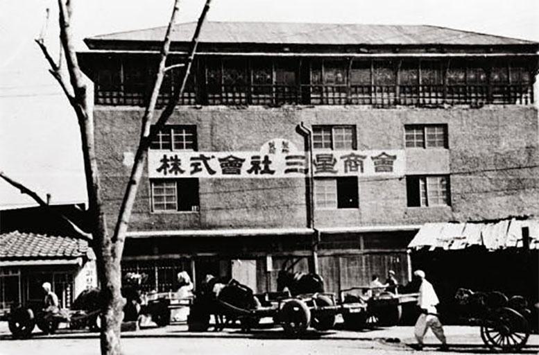
The company was founded as Samsung Sanghoe by Byung-Chull Lee, in the city of Taegu, Korea. The name itself translates to “Three Stars”, known in Korean symbolism as ‘hanja’ which translates to “big, numerous, and powerful”. The company got its start exporting dried local vegetables, fruit and fish to Manchuria and Beijing. For many years they operated without any branding or marketing and in 1958, Samsung presented their first logo.

The wordmark is written in Korean along with a circle enclosing three stars which are superimposed over three stripes and a couple of stylized wheat plants that represented the company’s agricultural roots.
The 1960s: The Future of Electronics
The business would profit immensely over the coming decades, spurning Lee to create subsidiaries and expand to new markets. What was once a simple export business was now beginning to flourish into a manufacturing empire which would offer an increasing variety of products.
In 1969, Lee founded Samsung-Sanyo Electronics. Their first product was a black and white television and the company decided to rebrand in order to reflect this new direction.

Here we see the 3 star motif taking more of a backseat as the wordmark is pushed to the forefront. The incorporation of the slightly rectangular box is intentional as the company’s goal is to dominate the television market, which is now reflected by the corporate identity.
The 1980s: Age of Mobile Telecommunication
In 1985, Samsung introduced the SC-1000, a mobile unit which was engineered for in-car use only. It would mark the beginning of a new chapter in Samsung history, heralded by a new logo.

In this iteration, Samsung’s designers explored further simplicity, removing the outside circle which had long been a visual staple of the brand and substituting it for the three stars which are composed of minimal diamond shapes placed at interlocking angles. With the sharp lines and use of negative space, we can see the company’s transition towards a more tech-oriented identity.
1993: The Frankfurt Declaration
From the 1980’s to the early 90s, the mobile market would become very competitive. Samsung’s chairman Kun-hee traveled the world to review the company’s standing. In 1993 he invited 200 company executives to Frankfurt where he would deliver a stirring, 3-day speech outlining an elaborate roadmap for the company’s future.

His vision would lead to market dominance on the mobile front, while spurring designers to create a more modern brand. This update features the most notable visual departure from earlier logos. Gone are the three stars that once defined the company. The wordmark has taken center stage, carved from a blue ellipse tilted at a 10-degree angle. This was meant to be a graphic representation of the universe - a symbol of the company’s perpetual ambition.
2015: The Bare Essentials
After two decades the logo is revisited once more, this time eliminating the blue ellipse and focusing completely on the wordmark.
 ## Conclusion
Today one can only marvel at how far this company as come. Who could have known that a humble merchant shipping vegetables, fruit and fish to three locations would eventually spearhead a global empire of household electronics and wearable computers. Samsung’s ever-changing business model is reflected in the company’s brand - one that is sure to evolve in the coming years.
Fine Print Art is an educational independent research publication. The above content has not been officially sponsored by Samsung Electronics Co., Ltd.