History of the Google Logo
It’s hard to imagine a company that has enjoyed as much success as Google. In the span of a few years it managed to build a brand that takes most businesses several decades. Their colorful trademark has become a staple of the online experience for billions of people, and has a surprisingly rich history despite its youth.
The story of Google begins in 1996. Back then it was just a fledgling research project at Stanford University, code-named “Back Rub” by founder Larry Page. There was even a logo for it:
Things started changing pretty quickly however. The project was renamed to Google - a misspelled version of googol, which is the number one followed by a hundred zeros. The goal was to hit home the idea that Google had massive processing potential and could handle troves of data that other search engines could not. In 1997 Google’s first branding incarnation was finally visible on Stanford’s servers.
The story behind this design remains somewhat of a mystery. Perusing Wikipedia and Google’s own history claims, there is no info on the designer or origin of this logo. One can already see the brand taking shape in the form of those playful colors and use of letters exclusively to forge their wordmark.
In 1998 Google co-founder Sergey Brin got his hands on a copy of Gimp and cranked out the next iteration of the logo, putting it in closer territory to the brand we are so familiar with.
In 1999 this same logo was updated. The colors were switched around and an exclamation point was added, probably inspired by the Yahoo logo at the time.
By this point Google’s success was dwarfing the competition. People who had formerly used Altavista, Hotbot, Mamamia, and countless other services began to flock to Google thanks to its superior searching capabilities. The company hired designer Ruth Kedar to continue to evolve the brand. At the time she had no clue just how huge the company would become, but was happy to crank out a few designs for them.
Her first attempt was done with Adobe Garamond as the typeface. Overall Kedar didn’t want to meddle too much with the text and compromise legibility, so she added a bit of her own whimsy via primary colors and the two-dimensional O’s. The small pattern joining them together was supposed to symbolize an infinite connection. According to Kedar, “Brin and Page liked this because it looks a bit like a Chinese finger trap.”
In this version Kedar decided to focus on one of the O’s, adding a hint of that infinite pattern from the previous iteration, but also adding the target aspect to the one O in order to hit home the precision which was making the search engine so successful. Founders “Brin and Page wanted to clearly differentiate Google from competing search engines and convey that the service was a search provider first and foremost, with an algorithmically complex yet simple-to-use application” Kedar says.
The next iteration featured a shift in Typeface and layout. Kedar opted for ITC Leawood and overlapping circles joined with a target to establish the intertwined and globally targeted nature of the business. Kedar felt that this one was a bit too close to the Olympics logo for her liking.
In this version Kedar stumbles upon Catull, the typface we have all grown to associate with the brand. The flatness of the rendering gives the logo a more corporate feel but the playfulness is still evident in the sizing of letters. While it was a step in the right direction, this design proved to be a bit busy to make the final cut. The founders liked the magnifying glass and the cross hairs, but not all at once.
Working off the feedback from the founders, Kedar simplified the previous design, eliminating the crosshairs while keeping the magnifying glass with a smile on it - her attempt to reflect the positive user experience that the search giant could offer. The deviation of that second O from the baseline was her way of illustrating the unexpected twists and turns of the search experience, a concept that many of us are quite familiar with today.
Returning a bit to her first iterations, Kedar once again busts out the Leawood font. This time around she adds a touch of dimension and shading to the logo. The idea was to have the logo floating on top of the pure white layout that the founders had planned. This version also started more of a conversation on the colors and their respective order.
In this phase Kedar was told to explore a more simplified approach. The idea was to eliminate any recognizeable icons and have the brand truly stand on its own as a wordmark. Conceptually, this also liberated the company from a niche search market, opening the door for them to expand into other industries. Despite the paring down, the playful factor is still there in the positioning of the letters, showing the Google is an unconventional and fun company.
Kedar finally nailed the final design after many experiments with color. “There were a lot of different color iterations,” Kedar says. “We ended up with the primary colors, but instead of having the pattern go in order, we put a secondary color on the L, which brought back the idea that Google doesn’t follow the rules.”
For over a decade this logo stood the test of time as the company grew at an exponential rate. But Google never lost their whimsical approach to branding. Their logo would receive as many as 1500 facelifts in the form of Google Doodles.
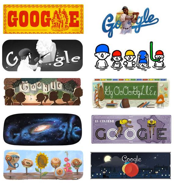
From Google’s site:
In 1998, before the company was even incorporated, the concept of the doodle was born when Google founders Larry and Sergey placed a stick figure drawing behind the second “o” in the word Google. This was intended as a comical message to Google users that the founders were “out of office” While the first doodle was relatively simple, the idea of decorating the company logo to celebrate notable events was born.
Two years later in 2000, Larry and Sergey asked the then current webmaster Dennis Hwang to produce a doodle for Bastille Day. It was so well received by our users that Dennis was appointed Google’s chief doodler and doodles started showing up more and more regularly on the Google homepage.
Google has kept an archive of all the doodles they produced. You can check that out right here. They also have carried a bit of their branding into their actual data centers, full gallery here.
Our story has almost drawn to a close. In fact if it had been written just 1 month ago it would have ended. However the brand saw one more iteration on September 19, 2013. The drop shadow and three-dimensional effect of the letters was removed in favor of a stark, minimal look. This is in keeping with the current trend of flat UI design made popular by the latest operating systems from Apple and Windows.
It’s anyone’s guess if Google’s logo will continue to change, but we think that it’s current form will stand the test of time and look forward to seeing thousands more great doodles from them.
*Update 9/1/2015: Google Unveils New Logo Design

As of today Google has taken a radical departure from its previous look and feel, eschewing their classic serif font for a custom sans-serif geometric face. The tech giant has given its brand a significant reboot this time around, building the new logo from the ground up. We wrote an in-depth post about Google’s bold new look right here on the blog. You can also see the full announcement on google’s design blog.
Fine Print Art is an educational independent research publication. The above content has not been officially sponsored by Google, Inc.