History of the Apple Logo: From Garage Start-Up to Tech Giant
The History and Evolution of Apple’s Iconic Logo
Beyond Apple’s epic legacy of innovative products lies an equally compelling history of corporate identity. One should expect nothing less from the company that helped to transform the industrial landscape and usher in a new age of personal computing - a foundation upon which so many businesses thrive today.
Editor’s Note: This topic hits close to home, as Apple has played an integral role in every business I have started. Back in grade school we were taught to use PCs. Those were the days of DOS - black screens with green text. It felt like a novelty but I wasn’t exactly floored.
Then in 1987 our school got a Macintosh Plus which was a game changer. The machine came preinstalled with the first version of Adobe Illustrator, sparking a lifelong interest in vector graphics. When Photoshop came out 3 years later I was in high school and rapidly became obsessed.
To this day, these applictions and the Mac OS are daily drivers for my designer wallpaper business - a testament to the lasting ingenuity behind Apple and its robust ecosystem.
Where Apple Got Its Name
Apple’s co-founder Steve Wozniak discusses the inspiration behind the name in his 2006 book “iWoz: Computer Geek to Cult Icon”
“I was driving Steve Jobs back from the airport along Highway 85. Steve was coming back from a visit to Oregon to a place he called an ‘apple orchard’. It was actually some kind of commune. Steve suggested a name – Apple Computer. The first comment out of my mouth was, ‘What about Apple Records?’ This was (and still is) the Beatles-owned record label. We both tried to come up with technical-sounding names that were better, but we couldn’t think of any good ones. Apple was so much better, better than any other name we could think of.”
And just like that, a billion dollar brand was born. Wozniak’s concerns turned out to be merited however, and in 1978 Apple Corps sued the company for copyright infringement. The suit would be settled 3 years later for an undisclosed amount. In the end it turned out to be a minor setback which didn’t seem to slow down this burgeoning company.
The Apple Orchard Connection
Interestingly, the “apple orchard” Jobs visited wasn’t just any commune. It was the All-One Farm, an apple orchard and commune in Oregon that was part of the Back to the Land movement of the 1970s. Jobs had spent time there during a period of soul-searching before co-founding Apple. This connection between Jobs’ personal journey and the company’s name adds an intriguing layer to Apple’s origin story, linking the tech giant’s birth to the counterculture movement that was reshaping American society at the time.
Alternative Names Considered
While “Apple” ultimately won out, Jobs and Wozniak did consider other names. Some of the alternatives they brainstormed included:
- Executek
- Matrix Electronics
- Personal Computers Inc.
These more technical-sounding names reflect the nature of the product but lack the simplicity and approachability that “Apple” conveyed. The choice of “Apple” was a deliberate move away from the cold, corporate image of existing computer companies, aligning with Jobs’ vision of making computers friendly and accessible to everyone.
Wozniak and Jobs had developed a revolutionary personal computer built around a screen and pointing device which stood in radical contrast to the console-based computers and word processors of the time. In tandem with this feat of engineering, they would continue to develop the Apple brand, eventually referring to their invention as ‘Macintosh’ - a particular variety of which Steve Jobs was fond, especially during his famous phase of frugivore dieting.
By this point it was becoming clear: big things were brewing in an understated garage on Crist Drive in Los Altos, California which would serve as Apple’s first base of operations.

The Garage Myth
While the garage at 2066 Crist Drive in Los Altos is often cited as the birthplace of Apple, Steve Wozniak has since clarified that its role in Apple’s early days has been somewhat mythologized. In a 2014 interview with Bloomberg Businessweek, Wozniak stated:
“The garage is a bit of a myth. We did no designs there, no breadboarding, no prototyping, no planning of products. We did no manufacturing there. The garage didn’t serve much purpose, except it was something for us to feel was our home.”
This revelation doesn’t diminish the humble beginnings of Apple but rather highlights how powerful the garage startup narrative has become in Silicon Valley lore.
The Creation and Development of Apple’s Famous Icon
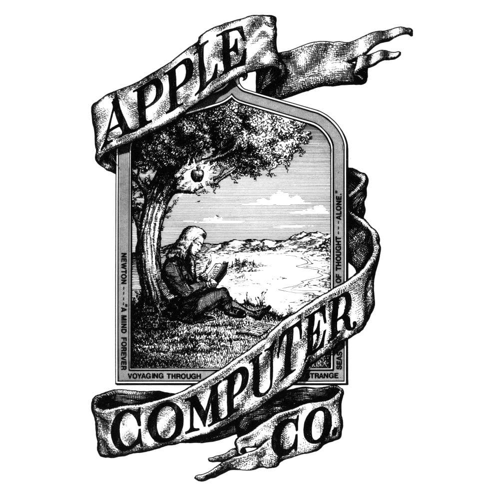
The first Apple logo was designed by Steve Jobs and Ronald Wayne in 1976, featuring Isaac Newton sitting under an apple tree. It was inspired by a quotation by Wordsworth that was also inscribed into the logo that said: “Newton… a mind forever voyaging through strange seas of thought” with ‘Apple Computer Co.’ on a ribbon banner ornamenting the picture frame.
The Short-Lived Newton Logo
This original logo, often referred to as the “Newton Crest,” was used for less than a year. Despite its short lifespan, it encapsulated several key elements that would remain central to Apple’s brand identity:
- The connection to knowledge and discovery (symbolized by Newton)
- The apple as a central motif
- A sense of artistic and literary inspiration (the Wordsworth quote)
However, Jobs quickly realized that this intricate design was difficult to reproduce at small sizes and didn’t convey the modern, approachable image he envisioned for Apple.
It was a promising start, but also quite detailed and not iconic enough to produce at small scales. In the end Steve wasn’t 100% convinced and decided to seek outside consultation.
The Design Process: Inside Rob Janoff’s Studio
In early 1977, Apple Computer still needed a logo to launch alongside the Apple II, Steve Jobs turned to Regis McKenna, a prominent Palo Alto advertising agency that was already working on Apple’s marketing strategy. Jobs assigned the project to Rob Janoff, a young art director at the firm who had been working in Silicon Valley agencies since 1970.
The brief was refreshingly simple. The only direction given to him being, “don’t make it cute” - a stark contrast to the detailed specifications typically demanded by corporate clients of the era. This minimalist direction would prove crucial to the logo’s enduring success.
The Methodology: A Week with Real Apples
Janoff’s approach was startlingly straightforward and physical. “I just bought a bunch of apples, put them in a bowl, and drew them for a week or so to simplify the shape” he later recalled. This hands-on methodology stood in sharp contrast to the conceptual, committee-driven design processes dominating corporate America in the 1970s.
“I was going for the silhouette of an apple, but to make it look more like an apple and not some other round fruit, I did what one does with an apple, I took a bite out of it.” The bite mark served a practical design function - ensuring immediate recognition and preventing confusion with cherries or other round fruits at smaller reproduction sizes.
Revolutionary Corporate Departure
To understand how radical Janoff’s approach was, consider the corporate design landscape of 1977. IBM established itself as a leading technology innovator, it adopted the iconic striped logo design it is now famous for. This was a dramatic departure from its traditional ornate logo, reflecting the sleek, bold aesthetic of modernism - yet even IBM’s “radical” striped approach maintained formal, corporate typography and monochromatic presentation.
Almost every brand would become simpler over time. Serifs became sans serifs, multiple colors became monochrome, etchings became silhouettes, and realism became geometric. Most technology companies were still using complex monograms, serif typefaces, and formal corporate imagery that emphasized institutional authority over approachability.
The Immediate Approval
Perhaps most remarkably, Steve Jobs was only offered one design for Apple’s logo – which he accepted. Janoff says he hasn’t repeated that practice since. “I think a lot of it was the naivety and inexperience of both Steve and I at the time. I always have more than one design now.”
This single-concept approval was virtually unheard of in corporate design. Janoff went to Jobs with final sketches of his work, Jobs just smiled, nodded and didn’t say much. Everything went very smoothly - a stark contrast to the typical revision cycles and committee approvals that characterized corporate branding projects.
The Color Strategy
The rainbow stripes weren’t arbitrary aesthetic choices. “The real solid reason for the stripes was that the Apple II was the first home or personal computer that could reproduce images on the monitor in color.” Each stripe was printed in its own specially mixed color, which Jobs approved because he felt that vivid colors improved people’s emotional response.
Editor’s Note: Specially mixed colors were nothing new, but signalled Apple’s entry into the upper echelon of global brands.
The origins of this practice date back to the invention of chromolithography in the 19th century. Building on the groundwork of lithography by Alois Senefelder, French printer Godefroy Engelmann patented chromolithography in 1837, a process that used multiple stones with various inks, enabling the mass production of consistent, colorful prints and setting the stage for the use of distinctive, brand-specific colors in modern advertising and packaging, imparting a sense of consistency and trust among consumers.
The earliest companies to adopt specially mixed colors include BMW, United Airlines, Pepsi Cola, Shell, Coca-Cola, and Standard Oil. BMW introduced color into its logo as early as 1929, while Shell and Standard Oil began using bold color schemes in the early to mid-20th century. These pioneering brands were among the first to implement strict color standards and brand guidelines, setting the stage for the vibrant, consistent brand identities seen in modern advertising and packaging
This technical capability positioning represented another departure from industry norms. While competitors emphasized processing power and business functionality, Apple was using its logo to communicate creativity and user experience - concepts largely foreign to technology marketing in 1977. Even at this early phase of its development Apple was changing the game.
The Two-Week Timeline
The entire design process took roughly two weeks to complete, from initial assignment to final approval. This compressed timeline reflected both the startup’s urgency and the decisiveness that would become Apple’s trademark. For context, corporate logo redesigns at established companies typically took months or even years to complete.
The efficiency of Janoff’s process - buying real apples, sketching silhouettes, adding the bite for clarity, applying rainbow stripes for technical positioning, and receiving immediate approval - represented a fundamentally different approach to corporate identity development. It prioritized intuitive design decisions over market research, focus groups, and iterative committee input.
This design philosophy would prove prophetic. Rob Janoff, back then, a young man, never imagined that Apple would become the most expensive brand, and his logo the most known, even more than Coca Cola and Google - a testament to the power of simple, purpose-driven design over conventional corporate branding approaches.

The Rainbow Apple: A Stroke of Genius
Janoff’s creation of the rainbow apple logo was a masterstroke of design that perfectly aligned with Apple’s brand values and the technological capabilities of their products. It’s worh reiterting the elements of its success as it’s THE case study for successful branding.
-
The rainbow colors weren’t just aesthetic: They were chosen to showcase the Apple II’s color display capabilities, a significant selling point at a time when most computers could only display monochrome graphics.
-
Specific color order: The colors were specifically ordered with green at the top, mimicking the leaf’s color. This attention to detail helped make the apple instantly recognizable as an apple, despite its stylized design.
-
Designed for longevity: Despite being created in 1977, the basic shape of Janoff’s apple has remained unchanged for over four decades, a testament to the timelessness of his design.
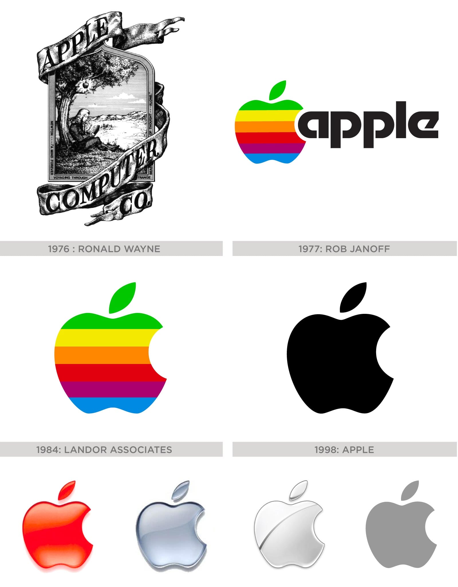
Since then the logo endured small iterations over the years. Landor Associates eliminated the wordmark in favor of the icon in 1984. It would later take on a stark black look in 1998, followed by more polished 3D versions and finally the flat/white or gray versions we see today.
The Monochrome Era and Beyond
The shift to a monochrome logo in 1998 marked a significant change in Apple’s visual identity, coinciding with the company’s resurgence under the returned leadership of Steve Jobs. This change reflected several factors:
-
Sleeker product design: The monochrome logo complemented the more refined, minimalist design of products like the iMac G3 and later the iPod.
-
Cost-effective branding: A single-color logo was cheaper to reproduce across various media and products.
-
Versatility: The monochrome design allowed for greater flexibility in how the logo could be used across different applications and materials.
-
Maturation of the brand: Moving away from the rainbow colors signaled Apple’s evolution from a quirky startup to a serious, premium tech brand.
The subsequent iterations of the logo, including the glossy 3D version introduced in the early 2000s and the flat design adopted in 2013, have each reflected contemporary design trends while maintaining the core shape established by Janoff.
Editor’s Note While I’d already used Macs extensively at ad agencies for marketing and illustration, this era of Apple’s brand was especially meaningful because it was the first one I bought for myself - a Powerbook G3. By today’s ultra-thin standards, it was chunky and clunky. But at the time it was nothing short of a revolution for my workflow, since I could take and present my work literally anywhere.
I started a freelance business from that laptop and will always look back on this era with great fondness because it set the stage for independence and productivity while fulfilling my dream of owning my own business and traveling abroad. This portable powerhouse is what allowed me to develop Fine Print NYC, Fine Print School, and Fine Print Art Blog, all platforms that fuel my business and deliver value to customers and casual browsers alike to this day.
Myths, Speculation & Symbolism
The Apple brand was such a massive success that it would invite constant speculation as to its meaning or purpose.
One of the most popular theories came from artists and authors like Sadie Plant of Zeroes and Ones, who considered the Apple logo as an homage to Alan Turing who was persecuted for his homosexuality and committed suicide by eating a cyanide-laced apple. Turing was the father of modern computing, and revolutionized the overlapping fields of math, science and technology with his published paper “On Computable Numbers”.
The Turing Connection: Myth and Reality
While the connection between Apple’s logo and Alan Turing is a compelling narrative, it’s important to note that this was not the original intention behind the design. However, the association has taken on a life of its own:
-
Embracing the myth: Despite not being the original inspiration, Apple has not shied away from the Turing connection. In 2011, the company altered its logo to feature a rainbow design in honor of Gay Pride, indirectly acknowledging the Turing association.
-
Turing’s rehabilitation: In 2009, then-Prime Minister Gordon Brown made a public apology for Turing’s treatment by the British government. In 2013, Queen Elizabeth II granted him a posthumous pardon. These events brought renewed attention to Turing’s story and its perceived connection to Apple’s logo.
-
Pop culture reinforcement: The 2014 film “The Imitation Game,” starring Benedict Cumberbatch as Turing, further popularized his story and indirectly strengthened the perceived connection to Apple’s brand in the public imagination.
Others would draw inevitable comparisons to the Garden of Eden, where Eve took a bite from a forbidden fruit. It’s an attractive idea, particularly when one considers the fruit was picked from the Tree of Knowledge, granting her wisdom of the gods as she gave in to temptation of the talking serpent.
This idea was bolstered by the fact that some of Apple’s earliest prototypes were sold for $666.66. Apple tech service manager Archie D’Cruz elaborates on this in his detailed response to a question on Quora:
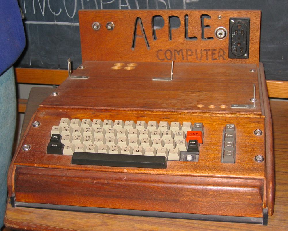
“Each computer cost Jobs and Wozniak about $250 to put together and they decided to offer it to the store at the wholesale price of $500. Retail price would be about a third more, which came to $666.66. Wozniak said that as a mathematician, he liked repeating numbers, so instead of rounding it up, that’s the figure they went with.”
The $666.66 Price Tag: Debunking the Myth
While the $666.66 price tag has fueled much speculation about hidden meanings or occult references, the reality is much more mundane and speaks to the practical, somewhat whimsical nature of Apple’s founders:
-
Wozniak’s fondness for repeating digits: As a programmer, Wozniak had an affinity for patterns in numbers. He has stated that he simply liked the repeating digit aesthetic of $666.66.
-
No connection to the biblical “Number of the Beast”: Both Wozniak and Jobs have consistently denied any intentional reference to the biblical connotations of 666.
-
A marketing accident: The unconventional price point generated buzz and free publicity for Apple, an unintended but welcome side effect.
-
Practical considerations: The price was a simple markup calculation based on component costs and desired profit margins, with no deeper symbolic meaning intended.
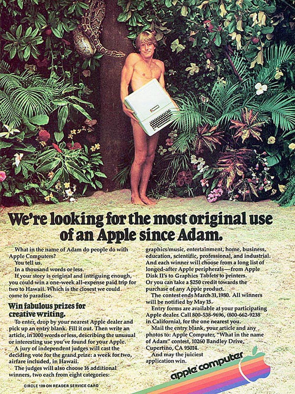
The concept wasn’t lost to Apple’s marketing team either, which made playful references in some of their earliest advertisements.
When you think about it the humble apple carries a lot of symbolic power, presenting itself throughout history as the center of many stories and traditions.
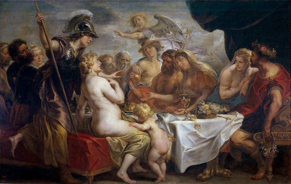
In Greek mythology, immortality can be found in the Garden of the Hesperides , where nymphs gain eternal life by eating golden apples which are guarded by a dragon with a hundred heads. The entire Trojan war itself was also indirectly spawned by a divine fight over a golden apple which was provoked by Eris, goddess of dischord.
Today, everyone knows the story of Snow White and aside from modern lore, apples form a significant part of our rituals and vernacular. Whether you are bobbing for them on Halloween, presenting one to a teacher as a gift or simply eating one a day to keep the doctor away, it is clear that notions of health, wisdom and temptation are common associations.
It’s difficult to pinpoint exactly why this is the case. Perhaps it’s the polished appearance, the contrast of skin color. Maybe it’s the uniquely satisfying crunch from that first bite. Whatever the case apples never failed to captured both our appetites and imaginations, making it an ideal symbol for a popular product.

The Biting Truth
Despite all speculation and theories, the reasoning behind Apple’s logo was a lot more practical according to Janoff, who apparently used the bite for clarity’s sake to represent the appropriate scale.
From his interview with Forbes Magazine
“The apple shape itself didn’t have anything to do with computers. It’s to get people to notice that an Apple computer was not some piece of hard-edged metal that has no place in your home and that your kid wouldn’t want to be near. Lots of different fruits have a stem, are sort of round with a leaf dangling off of it. So the bite in the apple was initially meant to indicate that it was an apple, and not something else. Also metaphorically the bite indicated biting into all the knowledge users would get out of this computer.
What’s funny, though, is after I came up with it my creative director, Chip, said “Oh guess what, Rob. You just designed something you didn’t realize. The word ‘byte’ is a computer word. And you took a bite out of Apple.” I wasn’t computer literate enough to see that initially. And I was like, there’s a bit of wit that will last! Any logo that makes a joke or engages you in that way you’re going to remember. And the rainbow colors had to do with the USP of this product. The Apple computer was the only one that could show images in color.”
Steve Jobs expressed some regret that such parallels were not drawn in the conceptual stages. When asked directly by writer/actor Stephen Fry if the logo was inspired by Turing he said “God we wish it were. It’s just a coincidence.”
The Continued Search for Meaning
Even today the speculation continues. Apart from the symbolism of the logo some artists have visually analyzed the logo’s design. Probably one of the more interesting studies is by graphic designer Thiago Barcelos who applied the Fibonacci sequence, or Golden Ratio as the underlying structure of the logo. His work illustrates one of the more subliminal reasons why Apple’s brand may have endured the test of time, despite its famously rapid pace of innovation. The folks over at Edible Apple Blog poked a bit of fun with this idea, creating a mockup of what current Apple products might look like with the old rainbow logo.
The Golden Ratio and Apple’s Design Philosophy
The application of the Golden Ratio to Apple’s logo, while likely unintentional in the original design, aligns well with Apple’s overall design philosophy:
-
Attention to Detail: Apple’s products are known for their meticulous design, often incorporating subtle mathematical and geometric principles.
-
Aesthetic Harmony: The Golden Ratio is often associated with natural beauty and aesthetic perfection, qualities that Apple strives for in its product design.
-
Subliminal Appeal: Even if not consciously recognized, the use of pleasing proportions can make a design more appealing to viewers.
-
Design Legacy: The possible presence of the Golden Ratio in Apple’s logo connects it to a long tradition of design and art, from ancient Greek architecture to Renaissance paintings.
-
Myth-Making: The idea that Apple’s logo incorporates the Golden Ratio has become part of the company’s mystique, regardless of whether it was an intentional design choice.
Easter Egg: How to Type the Apple Logo with Your Keyboard
On Mac OS, hold down the Shift and Option keys then press the letter ‘K’, and a postscript version of the font will appear, sized down and scaled to whatever block of text you are writing.

iOS devices also have the font baked in but it is not as accessible with a keyboard shortcut. Thankfully, there is a workaround which will allow you to summon the icon at will.
Windows users can open the Character Map app. Press Windows+R keys from keyboard to open Run window and then type the word charmap and hit Enter. Select font face “Baskerville Old Face” from Font drop-down menu. Scroll-down a bit and you’ll see Apple logo in the characters list. Select the Apple logo symbol, hit the “Select” and then “Copy” buttons to copy the Apple character to clipboard.

The Apple as Popular Iconography
The apple’s rich symbolic history has made it an ideal choice for branding beyond just Apple Inc. Here are some interesting examples of how the apple has been used in other commercial and cultural contexts:
-
The Big Apple: New York City’s nickname, popularized in the 1920s, is thought to have originated from horse racing slang where the prizes, or “big apples,” were awarded at NYC racecourses.
-
Apple Records: The Beatles’ record label, founded in 1968, used a Granny Smith apple as its logo. This led to a series of trademark disputes with Apple Computer that weren’t fully resolved until 2007.
-
Apple Bank: Founded in 1863 as the Haarlem Savings Bank, this New York-based bank rebranded as Apple Bank in 1983, leveraging the apple’s associations with New York City.
-
Applebee’s: The restaurant chain, founded in 1980, uses an apple in its logo, playing on the wholesome, all-American associations of the fruit.
-
Apple Vacations: This tour operator, founded in 1969, uses an apple to symbolize the sweetness and desirability of vacation experiences.
These examples demonstrate the versatility and enduring appeal of the apple as a symbol in branding and popular culture.
The Power of Simplicity: Apple’s Logo in Marketing
Apple’s logo has been a cornerstone of the company’s marketing strategy, embodying the power of simplicity in brand communication. The company’s advertisements often feature little more than the product itself and the Apple logo, a testament to the strength of both elements in carrying the brand’s message. This minimalist approach has become a signature of Apple’s visual identity, allowing the products to speak for themselves while the logo serves as a seal of quality and innovation.
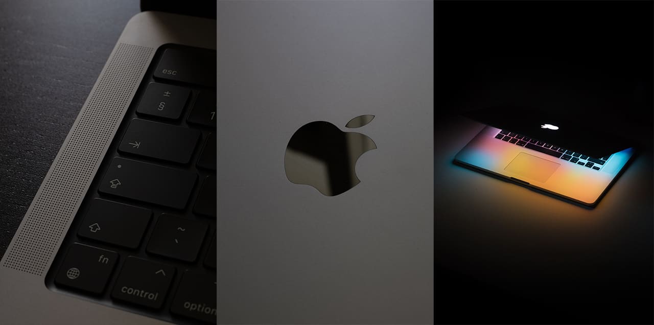
The logo’s simple design has proven remarkably versatile, maintaining consistency across Apple’s diverse product range. From the tiny AirPods to the expansive screens of iMacs, the apple silhouette remains instantly recognizable, tying together Apple’s ecosystem of devices and services. This visual continuity has played a crucial role in building and maintaining Apple’s brand identity across decades of technological evolution.
The Ousting of Steve Jobs: A Change in Trajectory for Apple
It’s hard to imagine the Apple brand without Jobs, himself an iconic figure with his predictable fashion sense and the confident presentation style of a quintessential tech guru. But this is precisely what happened in 1985 following a power struggle with the company’s board of directors and then-CEO John Sculley. The main reasons for his departure were:
-
Management Style: Jobs was known for his abrasive, autocratic approach, which created friction within the company and made it difficult for him to work effectively with others, especially as Apple grew.
-
Product Failures: Two major products under Jobs’ leadership—the Lisa and the Macintosh—failed to meet sales expectations, leading to disappointment among executives and the board.
-
Clash with CEO: Jobs had recruited John Sculley from PepsiCo in 1983, but their relationship quickly deteriorated. After being removed from the Macintosh project, Jobs attempted to rally the board against Sculley, but the board sided with Sculley instead.
-
Boardroom Dynamics: The board, concerned about Jobs’ leadership and the company’s direction, ultimately decided to strip him of power. Accounts differ on whether Jobs was fired outright or resigned in protest, but the result was that he left Apple in September 1985.
After his departure, Jobs founded NeXT, which Apple would later acquire, paving the way for his return in 1997.
ColorSync: Apple’s Revolution in Color Mastery
While Apple’s rainbow logo symbolized the company’s commitment to color computing, a far more significant color revolution was quietly brewing in Apple’s labs. In late 1988, as the design world struggled with color consistency across devices, Apple began developing what would become the industry’s first integrated color management system.
The Crisis and the Solution
Before ColorSync, each device—monitors, printers, scanners—had its own color gamut with no standardized way to ensure consistency. This created a maddening technical limitation for graphic designers, photographers, and publishers who needed faithful color reproduction from screen to print. The existing solutions were prohibitively expensive and proprietary, offered by a few vendors at high costs.
The breakthrough came from an unexpected source: a solid wax inkjet printer project. Robin D. Myers joined Apple to work on color matching, collaborating with Gary Starkweather, who had previously invented the laser printer at Xerox PARC. Myers developed a new algorithm using XYZ tristimulus measurements that calculated mixing amounts for each device’s primary colors - mathematical foundations robust enough to become industry standards.
Revolutionary Integration
Apple’s masterstroke wasn’t just developing color management technology - it was integrating it directly into the operating system. The first public release of ColorSync (version 1.0) in January 1993 made Apple the first computer company to put color management into the operating system, allowing every user the ability to get accurate color images at low cost.
This democratization perfectly aligned with Apple’s design philosophy. Just as their rainbow logo communicated that computers could be friendly rather than corporate, ColorSync proved that sophisticated color science could be transparent and automatic rather than arcane and expensive.
Industry Leadership
Recognizing that color management needed to transcend platform boundaries, Apple co-founded the International Color Consortium (ICC) in 1993 alongside Adobe, Microsoft, and Kodak to create open, cross-platform color profile standards. This industry leadership established Apple as the company that solved fundamental creative workflow problems, not just built hardware.
ColorSync’s evolution - from the initial 1993 release through ColorSync 2.0 (1995) with ICC profile support to ColorSync 4.0 (2001) fully integrated into Mac OS X - cemented the Mac’s reputation as the platform of choice for creative professionals.
Editor’s Note: As someone building a printing business during ColorSync’s early years, I witnessed how revolutionary this technology was. Before ColorSync, color matching required expensive, specialized equipment. Suddenly, accurate color reproduction became accessible to any designer with a Mac - democratizing professional-quality color work in ways that directly paralleled Apple’s approachable design philosophy.
From a practitioner’s perspective, ColorSync’s influence on our current wallpaper restoration processes is direct and measurable. The color-matching protocols we use today for matching vintage wallpaper hues - where we need to nail colors within 1-3 proof rounds - trace back to the color management concepts Apple pioneered. The same mathematical principles Myers developed for device-to-device color translation now help us match 100-year-old pigments using modern UV-cured inks.
NeXTSTEP for Apple: The Return of Jobs
In the mid-1990s, Apple was in deep financial and creative trouble, facing massive losses, product flops, and a dwindling market share. By 1997, the company was just weeks away from bankruptcy. Apple sought to revitalize its technology and operating system.
After failed talks with Be Inc., Apple acquired Jobs’ company, NeXT, in February 1997 for $400 million. This deal brought Jobs back into Apple as an adviser and, soon after, as interim CEO. When then-CEO Gil Amelio was ousted in July 1997, Jobs became the de facto chief and was officially named interim CEO on September 16, 1997.
Jobs immediately began streamlining Apple’s product line, cutting unprofitable projects like the Newton and ending the Macintosh clone program.
Editor’s Note: Most people don’t remember this but the Mac clones were a very big deal. Companies like Power Comuting, Umax and Motorola were producing very fast and capable machines for a fraction of the cost.
Many design firms jumped at this opportunity because these Macs had superior specs and performance compared to Apple products. With so many companies competing it was a glorious time to be a mac fan, however it’s easy to see why this program was phased out as it would have led to the demise of Apple as a hardware manufacturer, something that Steve Jobs worked too hard to simply give up.
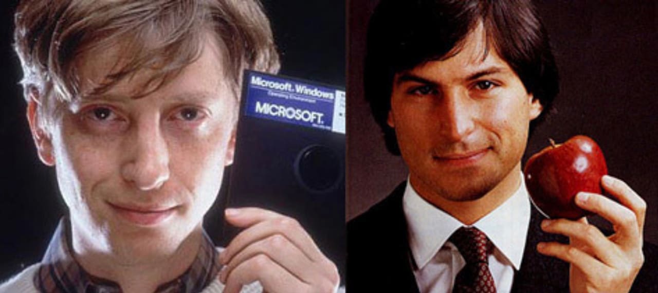 Image courtesy of Kay Kim
Jobs’ return was not universally celebrated at first. At Macworld 1997, he was booed for announcing a $150 million Microsoft partnership, but he insisted that his job was to save Apple, not win a popularity contest. The NeXT acquisition not only brought Jobs back, but also delivered the NeXTSTEP operating system, which became the foundation for Mac OS X, one of the primary drivers of Apple’s adoption in the coming years. His leadership also led to the launch of the iMac, which was a commercial hit and helped return Apple to profitability within a year.
Think Different: A Bold Marketing Move
Apple’s “Think Different” campaign was probably the most visible aspect of the new Jobs era at Apple. It was conceived by the Los Angeles office of TBWA\Chiat\Day, Apple’s long-time advertising agency. The campaign was launched with a $90 million annual advertising budget, reflecting Apple’s high-stakes gamble on redefining its brand.
Steve Jobs, having just returned to Apple as interim CEO, was determined to revive the brand’s countercultural spirit and reconnect with its core audience of creative thinkers and innovators. The airing of its commercial “The Crazy Ones” created a perfect marketing storm fo Apple, perfectly embodying this renegade spirit.
“Here’s to the crazy ones, the misfits, the rebels, the troublemakers, the round pegs in the square holes… the ones who see things differently — they’re not fond of rules… You can quote them, disagree with them, glorify or vilify them, but the only thing you can’t do is ignore them because they change things… they push the human race forward, and while some may see them as the crazy ones, we see genius, because the ones who are crazy enough to think that they can change the world, are the ones who do.”
The original “Crazy Ones” commercial was narrated by actor Richard Dreyfuss, though a version with Steve Jobs’s own voice was also produced (and later surfaced online).
Key Creative Figures:
Craig Tanimoto, a junior art director at TBWA\Chiat\Day, is widely credited with inventing the “Think Different” line and the concept of pairing it with powerful black-and-white portraits of historical visionaries. The slogan was a deliberate play on IBM’s “Think” campaign. Tanimoto’s idea was to underline Apple’s rebellious, creative ethos in stark contrast to IBM’s corporate image.
Rob Siltanen and Ken Segall, both creative directors, co-wrote the script for the iconic “Crazy Ones” commercial, with input from the broader team at the agency and Apple. Steve Jobs was deeply involved in the campaign’s development but was not the mastermind behind its creative concept. He initially disliked the words of the TV commercial but later changed his mind after seeing the finished product. However the agency never underestimated his influence.
“Without Steve Jobs there’s not a shot in hell that a campaign as monstrously big as this one would get even close to flying off the ground…it got an audience that once thought of Apple as semi-cool, but semi-stupid to suddenly think about the brand in a whole new way.” — Rob Siltanen
Lee Clow, TBWA’s legendary creative chief, played a pivotal role in shaping the campaign, ultimately approving the use of “different” as a noun at Steve Jobs’s insistence. There was internal debate over the grammar of the slogan. Jobs was adamant about using “ifferent” instead of the grammatically correct “differently,” arguing it sounded more colloquial and impactful—like “think big” or “think victory”.
Campaign Execution
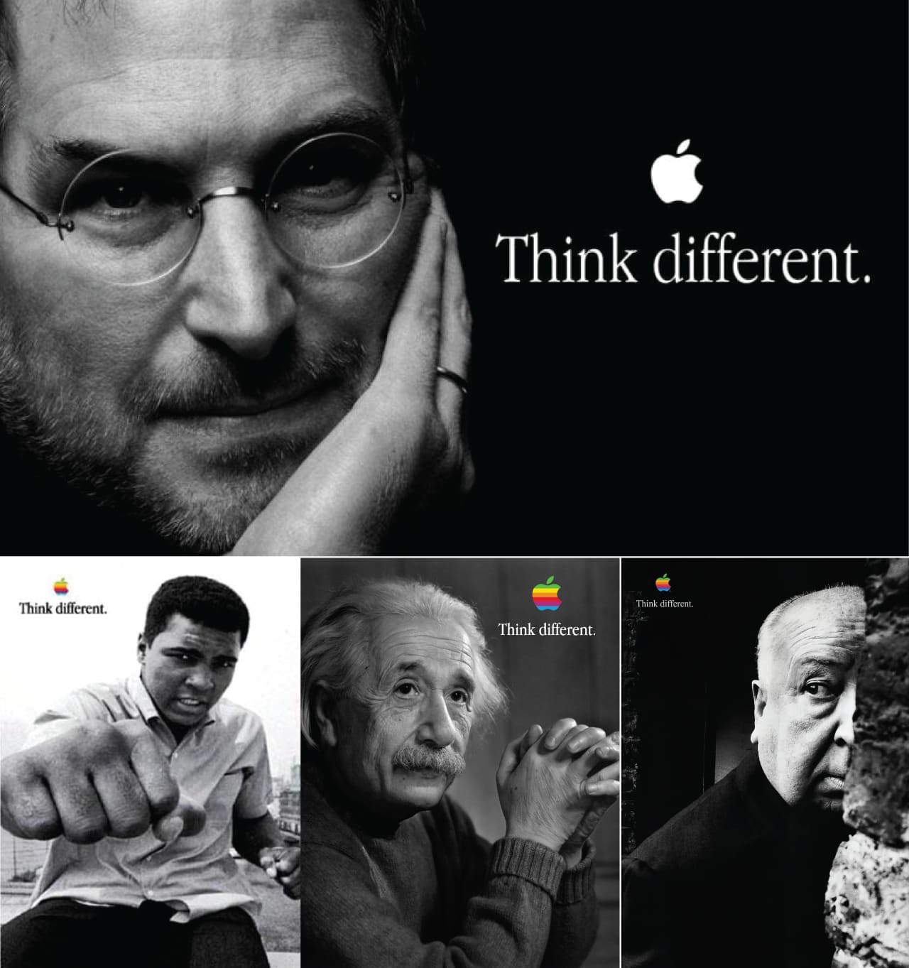 Image courtesy of Apple Inc.
The campaign’s print and TV ads featured black-and-white images of iconic figures such as Albert Einstein, Martin Luther King Jr., Mahatma Gandhi, John Lennon, and Amelia Earhart—none of whom had any direct connection to Apple products. As a marketing first, the campaign did not directly showcase Apple products, instead focusing on values and emotional resonance.
The “Think Different” campaign was a massive success, winning the 1998 Emmy Award for Best Commercial and the 2000 Grand Effie Award for most effective campaign in America. It played a crucial role in rehabilitating Apple’s brand, restoring its “counter-culture” aura, and setting the stage for the successful launch of the iMac and, later, the iPod and iPhone.
Editor’s Note: Apple’s direction on marketing and merchandising was a huge influence on so many design firms in the late 90s. I remember hearing criticism of Steve Jobs and the audacity of placing himself among luminaries such as Einstein, Picasso & Muhammed Ali the latter of which probably best encapsulated this theme of unabashed grand-standing. This campaign was Apple’s way of shamelessly letting the world know it was “The Greatest”, and with all their innovation and creative prowess it quickly became apparent that this was not just idle talk.
This was a watershed moment in their brand as a company, cementing the idea that Macs weren’t just superior computers. They were a lifestyle built around the needs of geniuses and creative innovators who never really clicked with the corporate, buttoned-up ambience of Windows. The messaging was simple “All the cool kids use Apple”, and the world quickly fell into line with this narrative.
Apple’s Retail Presence: From Skepticism to Empire
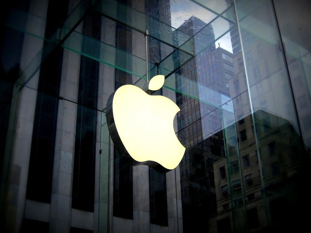 Image courtesy of Wikimedia Commons
In 2001, most industry experts thought Apple was making a catastrophic mistake when the tech giant announced it would abandon traditional retail partnerships and open 25 of its own stores - a move many predicted would end in spectacular failure. “I give them two years before they’re turning out the lights on a very painful and expensive mistake”, wrote BusinessWeek’s Cliff Edwards.
They couldn’t have been more wrong.
Apple’s retail frustrations had been mounting for years. The CompUSA experiment served as a prototype for the Apple retail stores that would follow. Inside a dedicated section of each CompUSA store, Apple-trained employees helped customers connect with Cupertino’s products, but the mini-stores were frequently located at the back of CompUSA outlets, and they didn’t get much in the way of foot traffic.
Steve Jobs envisioned something radically different. Working with Ron Johnson, former Target merchandising VP, Apple designed retail spaces that prioritized experience over specifications. “The Apple stores offer an amazing new way to buy a computer”, said Jobs. “Rather than just hear about megahertz and megabytes, customers can now learn and experience the things they can actually do with a computer, like make movies, burn custom music CDs, and publish their digital photos on a personal website.”
The Historic Opening
On May 19, 2001, the first two Apple Stores opened at Tysons Corner in McLean, Virginia, and the Glendale Galleria in Glendale, California. The doors of the Virginia store opened around 10 a.m. Eastern time, and a man named Chris Barylick was the first customer inside. He had been waiting some six hours for the opportunity.
The results were immediate and stunning. Over 7700 people visited and purchased a combined total of $599,000 of merchandise during their first two day weekend. Within three years, Apple reached $1 billion in annual sales, becoming the fastest retailer in history to do so.
The physical spaces themselves became landmarks. Oversized, illuminated Apple logos transformed storefronts into beacons visible from blocks away, while the clean lines, natural materials, and open layouts created an entirely new template for technology retail that competitors worldwide would attempt to replicate.
The Big Apple
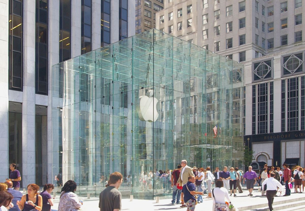 Apple’s iconic location on 5th Avenue in Midtown Manhattan, courtesy of Wikimedia Commons
Apple’s arrival in Manhattan marked a symbolic victory for the brand. On July 18, 2002, Apple’s first retail store in New York City opened in Manhattan’s SoHo district at 103 Prince Street.
“Fourteen months after opening our first retail store, our 31 stores are attracting over 100,000 visitors each week”, said Steve Jobs. Apple’s SoHo location included: two twenty-foot Genius Bars, expanded “solution centers” for music, photography and movies, an expanded kids section with 14 computer stations, a software section with more than 900 software titles for the Mac, and a 46-seat theater. Opening in the heart of New York’s creative district sent a clear message to the world about Apple’s firm foothold at the nexus of creative industry and commercial success.
Editor’s Note: Before Apple’s retail empire, creative professionals in New York had one essential destination: Tekserve - the first official Apple reseller in NYC, where young creatives could either buy used macs or drop off their ailing machines for repairs.
Founded in 1987, Tekserve grew from a small back-office Macintosh repair shop to become the largest single-location Apple Specialist and Premium Service Provider in the United States. Located on West 23rd Street in the Flatiron District, it was where I bought my first professional Macs in the late 1990s - powerful but affordable machines that made building Fine Print NYC financially possible for a fledgling startup.
Tekserve was everything an Apple Store isn’t: cluttered with vintage radios and antique computers, staffed by genuine Mac enthusiasts who knew your name, and filled with the kind of technological curiosities that reflected real passion for design history. Apple Store representatives had surreptitiously come to Tekserve to see how those with ailing machines had been tended to, when conceiving how to design “genius bars.”
Apple studied Tekserve’s customer service approach, then built a retail empire so successful it made the original obsolete. Tekserve closed on August 15, 2016 after 29 years, a bittersweet testament to how completely Apple had transformed technology retail. We gained democratized access to Apple products and support, but lost the personal, eccentric expertise that only a place like Tekserve could provide. Today, seven Apple Stores operate within walking distance of where Tekserve once stood.
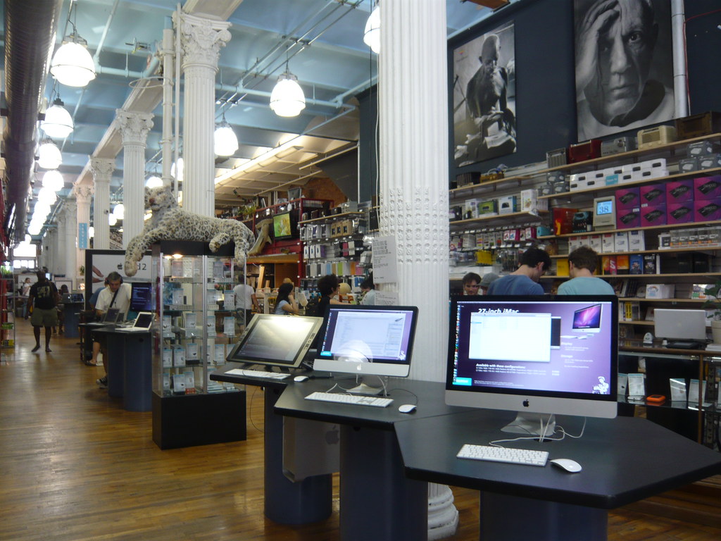 Photograph courtesy of Shinya Suzuki
“I’m a Mac”: Brand Identity Personified
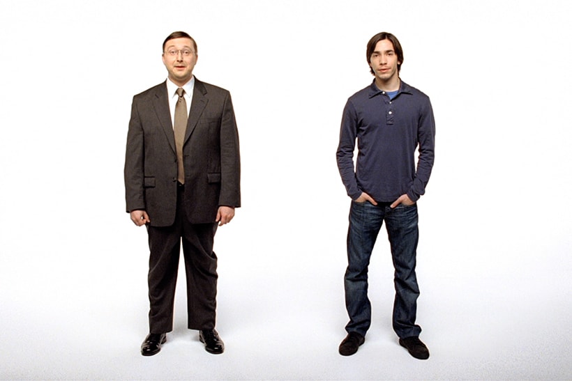 Image courtesy of Apple Inc.
Following the success of “Think Different,” Apple faced a new challenge in 2006. Despite the iPod’s massive success, Apple’s share of the US desktop and laptop computer market was at 4 percent. The company was preparing to launch Intel-based Macs - a major technical transition that needed explaining to consumers who were largely unfamiliar with why this mattered. Steve Jobs wanted something bigger than technical specifications.
The Grueling Creative Process
In September 2005: Steve Jobs handed down the assignment for a new Mac campaign at the weekly “Marcom” meeting between Apple executives and TBWA\Chiat\Day’s senior creative team. What followed was an excruciating eight-month search for the idea that would satisfy Jobs’ exacting standards.
The breakthrough came from a deceptively simple concept: personify the computers themselves. Rather than focusing on technical specifications or abstract benefits, the team created a standard template. They open to a plain white background, and a man dressed in casual clothes introduces himself as an Apple Mac computer (“Hello, I’m a Mac.”), while a man in a more formal suit-and-tie combination introduces himself as a Microsoft Windows personal computer (“And I’m a PC.”)
The Perfect Casting Chemistry
It was Steve Jobs’ idea to bring in Justin Long. He saw him in “Herbie: Fully Loaded” and thought he was a star on the rise. For the PC role, director Phil Morrison was drawn to John Hodgman, a writer and humorist from The Daily Show. They liked each other enormously and made each other laugh. Their senses of humor were in sync right away.
The production scale was massive. The team shot 323 spots over three years just to get the 66 that made it on air. This iterative approach allowed the characters to evolve beyond their initial adversarial relationship into something more nuanced - friends with fundamental differences.
Cultural Impact and Innovation
The campaign’s genius lay in transforming what could have been dry technical comparisons into genuine entertainment. The irony, given these were Mac ads, is that PC was clearly the better role, with Hodgman getting most of the funny lines and all the sight gags. This counterintuitive approach made the ads more engaging and less overtly promotional.
In 2010, Adweek declared “Get a Mac” to be the best advertising campaign of the first decade of the new century. The campaign’s influence extended far beyond technology marketing, spawning countless parodies and establishing a template for personification advertising that continues today.
Editor’s Note As someone running a creative business during this campaign’s peak years, I witnessed its impact firsthand. These ads didn’t just sell computers - they changed how creative professionals talked about technology choices. Suddenly, picking a Mac wasn’t just about specs or software compatibility; it was about creative identity. The campaign made technology selection feel personal and cultural rather than purely functional.
The “Get a Mac” approach influenced how we present technology choices to our wallpaper printing clients today. Rather than overwhelming them with technical details about UV inks and substrate options, we focus on outcomes and creative possibilities - the same shift from “what it does” to “what it means” that made these ads so effective. They also helped Apple further solidify itself as a brand for creative professionals.
When Branding Bites Back: Apple’s Marketing Missteps
What’s A Computer?
Despite its reputation for marketing brilliance, even Apple isn’t immune to missteps. While the company’s advertising campaigns have often set industry standards, some have missed the mark, stirring controversy and backlash instead of the intended buzz.
One particularly contentious example was a 2017 commercial for the iPad Pro. The ad, titled “What’s a Computer?”, aimed to showcase the iPad Pro as a versatile device capable of replacing traditional computers. However, its execution left many viewers feeling alienated or upset.
The commercial featured a young girl using her iPad Pro for various tasks throughout the day. When a neighbor asks her what she’s doing on her computer, the girl responds with the now-infamous line, “What’s a Computer?” This attempt to position the iPad as the future of computing backfired spectacularly, with many viewers finding the child’s response disingenuous and the overall message condescending.
Critics argued that the ad came across as smug and out of touch, implying that Apple’s target audience was so young that they wouldn’t even recognize a traditional computer. The backlash was swift and widespread, with the commercial becoming a subject of ridicule on social media and even spawning parody videos.
Everything You Need
Another controversial campaign was the 2019 iPad Pro advertisement that showed various creative tools and musical instruments being crushed by a hydraulic press, only to be replaced by an iPad Pro. The ad’s tagline, “Everything you need to work and create, all in one device,” was meant to emphasize the iPad Pro’s versatility.
However, many viewers, especially artists and musicians, found the imagery of destroyed instruments and tools deeply unsettling. The ad seemed to suggest that traditional creative methods were obsolete, which struck a nerve with many professionals who still rely on and value these tools. The violent imagery of the hydraulic press crushing beloved instruments also felt at odds with Apple’s usually sleek and minimalist aesthetic.
Apple Rival Samsung, claps back with their ad campaign “Creativity Can’t Be Crushed”, featuring a girl playing a beat up old guitar but reading her music on a tablet.
These missteps serve as a reminder that even with a strong brand and a history of successful campaigns, companies can still make errors in judgment. They highlight the delicate balance that must be struck in marketing, especially for a company like Apple that has cultivated an image of innovation and forward-thinking. Pushing boundaries in advertising can be risky, and even a brand as strong as Apple isn’t immune to public backlash when their message misses the mark.
In the grand scheme of Apple’s marketing history, these controversial campaigns are outliers in a sea of successful and influential advertisements. They serve as valuable lessons in the importance of understanding and respecting your audience, even as you attempt to challenge and expand their perceptions of technology and creativity.
The Future of Apple’s Logo
As Apple continues to evolve and expand into new product categories, its logo remains a constant. However, the way this iconic symbol is used and perceived may adapt to new technologies and changing consumer expectations.
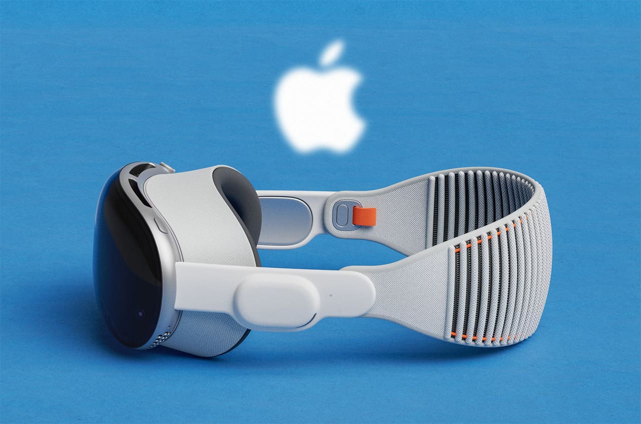
With Apple’s increasing focus on Augmented Reality (AR), we might see more dynamic, three-dimensional versions of the logo in digital spaces. Imagine an Apple logo that appears to float in mid-air or integrates seamlessly with your surroundings through an AR headset. This could open up new possibilities for interactive brand experiences, blending the physical and digital worlds in ways that reflect Apple’s position at the forefront of technology.
Services and Content Brand Extension
Apple’s expansion into services - from Apple TV+ to Apple Card to fitness subscriptions - has required the logo to work across entertainment, financial, and wellness contexts. The symbol that once sold computers now appears on Emmy-nominated television content, credit cards, and health coaching interfaces, demonstrating remarkable adaptability across industries.
Editor’s Note: As someone who has watched Apple’s brand evolution from the perspective of a creative professional and business owner, the most striking change in recent years is how seamlessly the logo now bridges physical and digital experiences.
In our wallpaper printing business, we see this integration daily - clients share inspiration images from Apple devices, collaborate through iMessage and AirDrop. The logo has become so embedded in creative workflows that it’s nearly invisible, which paradoxically makes it more powerful. It’s the ultimate achievement for any brand symbol: becoming essential infrastructure rather than mere decoration.
This evolution from logo-as-badge to logo-as-interface hints at where brand identity is heading. In an era where every surface can be a screen and every interaction can be digitally mediated, Apple’s logo serves as a constant anchor point in an increasingly fluid technological landscape.
Summary
The Apple logo’s journey from a complex Newton illustration to today’s versatile symbol reflects more than design evolution - it chronicles the transformation of technology from specialized tool to universal language. As we enter an era of spatial computing, artificial intelligence, and ambient technology, the bitten apple remains our most recognizable guide into the digital future.
What began as Steve Jobs and Rob Janoff’s simple solution to identify an apple-shaped symbol has become perhaps the most successful piece of visual communication in human history. Its power lies not in complexity, but in its ability to evolve meaning while maintaining form - a lesson in brand resilience that extends far beyond the technology industry.
In a world where most corporate symbols struggle to survive a single decade unchanged, Apple’s logo approaches its 50th anniversary as vital and relevant as ever. That may be the ultimate testament to the power of truly great design which transcends time.
Final Editor’s Note: It’s hard to overstate the impact that Apple has had, not just on the world of computing and software but on popular culture and creativity at large. As a digital printshop It’s even harder to imagine our workflow without the house that Jobs built. Everything from artwork creation, to color matching and proofing, all the way down the line to production is facilitated by the Mac and its intuitive, excellent operating system and ecosysyem of tools for power users and designers.
This isn’t to say that PCs don’t have their place. We definitely use them as well, but each and every creative aspect of our business, including marketing materials and the design/development of our websites, is done on an Apple computer. As innovators in our field, creative thinkers and power users, frankly we wouldn’t have it any other way.
Historical Timeline of Apple’s Branding Evolution
1976: Apple’s first logo, designed by Steve Jobs and Ronald Wayne, featured Isaac Newton under an apple tree with a quote from Wordsworth. It represented knowledge and discovery but was too complex for mass reproduction, prompting a redesign.
1977: Designer Rob Janoff created the iconic rainbow Apple logo to reflect the Apple II’s color display capabilities. The bite in the apple ensured the logo wouldn’t be mistaken for a cherry, and the design was immediately approved by Jobs with no revisions.
1977-1980: The slogan “Byte into an Apple” was used in marketing materials. It cleverly played on both the logo’s visual identity and a reference to the technical term “byte” emphasizing Apple’s user-friendly yet sophisticated technology.
1981: The first print ad for the Apple II ran with the tagline, “We’re Looking For The Most Original Use Of An Apple Since Adam.” This bold statement highlighted the creative potential of personal computing in an era when the concept was still emerging.
1983: Apple’s campaign, “Soon There’ll Be Just Two Kinds Of People. Those Who Use Computers, And Those Who Use Apples” positioned the brand as an inevitable force in the burgeoning personal computing market, setting it apart from competitors with accessible, forward-thinking technology.
1984: Landor Associates eliminated the wordmark in favor of the icon alone, marking Apple’s confidence that the logo could stand without text support. This bold move positioned Apple as one of the few technology companies whose symbol was recognizable enough to function independently, similar to Nike or Shell.
1984: The legendary “1984” Super Bowl ad, directed by Ridley Scott, introduced the Macintosh. This dystopian commercial painted Apple as a revolutionary brand breaking away from conformity, a defining moment in the company’s history and advertising.
1985: The Macintosh was marketed with the tagline, “The computer for the rest of us.” This emphasized ease of use and accessibility, key elements in Apple’s strategy to democratize personal computing, making it appealing to non-technical consumers.
1985: Steve Jobs left Apple following a boardroom coup, beginning a 12-year period where the company struggled with brand identity and market position. During Jobs’ absence, the logo remained unchanged while Apple’s brand messaging became increasingly unfocused, demonstrating the logo’s strength as a stable brand anchor during organizational turmoil.
1987: With “The Power To Be Your Best” campaign, Apple targeted professionals and creatives, cementing the Macintosh as a tool for artists, designers, and educators. This campaign reinforced the brand’s positioning in the creative industry.
1988: ColorSync development began at Apple under Robin D. Myers and Gary Starkweather, launching a color management revolution that would cement Apple’s position in creative industries. This behind-the-scenes technical innovation proved as important to Apple’s brand as the logo itself, solving fundamental workflow problems for designers and photographers.
1990: The “What’s on your PowerBook?” campaign promoted Apple’s first portable computer. It emphasized mobility and the idea that professionals could now take their work anywhere, which was groundbreaking at the time.
1993: ColorSync 1.0 was released as the first OS-integrated color management system, while Apple co-founded the International Color Consortium (ICC) with Adobe, Microsoft, and Kodak. These developments established Apple as the technology leader for creative professionals, reinforcing the brand values embodied in the rainbow logo even as the company prepared to abandon those colors.
1994: Apple introduced the Apple Garamond font as its corporate typeface. This move created a cohesive visual identity, with the font being used consistently in all branding and product marketing, reinforcing Apple’s polished and professional image.
1995: ColorSync 2.0 introduced major improvements including full ICC profile support, revolutionizing how creative professionals managed color across devices. This technical leadership in color science provided practical validation for Apple’s brand promise of superior creative tools, influencing professional adoption worldwide.
1997: Jobs returned to Apple and announced a controversial $150 million Microsoft partnership at Macworld, where he was initially booed by the audience. This moment marked the beginning of Apple’s brand rehabilitation, with Jobs declaring his job was to save Apple, not win popularity contests.
1997: The “Think Different” campaign was launched after Steve Jobs’ return to Apple. Featuring iconic figures like Einstein and Gandhi, it reinvigorated Apple’s image by associating the brand with innovation, creativity, and rebellious spirit.
1998: The iMac was introduced with the slogan “Hello (again).” The colorful, translucent design of the iMac broke with conventional beige computers, symbolizing Apple’s return to simplicity and user-centric design.
1998-2003: The Aqua-themed monochrome logo era began with the iMac launch, featuring subtle translucent effects that complemented Apple’s new design language. This transition period bridged the gap between the playful rainbow era and the minimalist approach that would define Apple’s modern identity.
Aqua Era (1998-2003): An Aqua-themed version of the monochrome logo was used from 1998 until 2003
1999: The “iThink, therefore iMac” print ads played on the famous Cartesian quote, reinforcing the iMac’s philosophical and design-driven difference from its competitors, appealing to consumers looking for something beyond just another PC.
2001: ColorSync 4.0 was fully integrated into Mac OS X, making professional-grade color management automatic and invisible to users. This seamless integration exemplified Apple’s design philosophy of hiding complexity behind simple interfaces, a principle reflected in the logo’s own evolution toward simplicity.
2001: With the “Rip. Mix. Burn.” campaign, Apple launched iTunes, positioning itself at the forefront of the digital music revolution. The slogan encapsulated the ease of copying, mixing, and burning music—activities that were becoming central to modern music consumption.
2002: The “Switch” campaign featured real people explaining why they switched from PCs to Macs, emphasizing the user-friendly experience of MacOS compared to the frustrations of Windows.
2003: The iPod silhouette campaign became instantly recognizable. The stark black silhouettes against vibrant backgrounds with white iPods and earbuds highlighted the ubiquity and cultural impact of the device, as well as its simplicity.
2004: The introduction of the iPod Mini came with the tagline, “1,000 Songs In Your Pocket.” This revolutionary concept redefined how people consumed music, further solidifying Apple’s dominance in the digital music market.
2006: The “Get a Mac” campaign, starring John Hodgman and Justin Long, humorously portrayed a Mac as cooler, friendlier, and more efficient compared to a dull, outdated PC. This campaign resonated widely, portraying Macs as fun and accessible.
2007: Apple introduced the iPhone with the slogan, “THis Is Only The Beginning” signaling a new era of smartphones. The iPhone revolutionized not only the mobile phone industry but the tech industry as a whole, with Apple now synonymous with innovation.
2007-2013: The glass-themed logo era introduced subtle dimensional effects and reflections, aligning with the premium materials and manufacturing techniques appearing in Apple products. This period saw the logo adapt to new contexts, from the illuminated Apple logos on MacBook lids to high-resolution Retina displays.
2008: The MacBook Air, advertised as the “World’s Thinnest Notebook” showcased Apple’s prowess in design and engineering. It was presented as a sleek, minimalist device for professionals on the go, highlighting Apple’s focus on portability without compromising performance.
2009: Apple filed for the trademark “THere’s An App For That” a phrase that became synonymous with the App Store’s vast ecosystem. It highlighted the transformative power of apps on mobile computing, where every task could be simplified with a tap.
2010: The iPad was introduced with the campaign “What is iPad?” marking the beginning of the tablet era. The ad focused on the iPad’s versatility and its potential to replace traditional laptops for certain uses, once again pioneering a new category.
2011: Siri, Apple’s voice assistant, was introduced with conversational ads that showcased its groundbreaking ability to understand and respond to natural speech, pushing forward the integration of AI in daily life.
2012: Apple switched from Myriad to Helvetica Neue as its corporate font, signifying a move towards a cleaner, more modern aesthetic that better matched its minimalist product designs and refined user interface.
2013: The “Designed by Apple in California” campaign emphasized Apple’s attention to detail and craftsmanship. It reaffirmed Apple’s commitment to quality and its heritage, at a time when the company was seen as a global leader in premium design.
Current Flat Design (2013-present): The transition to flat design coinciding with iOS 7’s visual overhaul
2014: Apple’s “Shot on iPhone” campaign featured user-generated content, showing that even everyday users could create stunning photography. This reinforced the iPhone’s position as the go-to device for amateur and professional photographers alike.
2015: The Apple Watch was introduced with the slogan, “The Watch Is Here.” This positioned Apple’s wearable tech as both a functional and fashionable accessory, appealing to a broad consumer base beyond tech enthusiasts.
2016: The “Practically Magic” campaign for the iPhone 7 showcased features like its new camera capabilities and water resistance, highlighting Apple’s continuous innovation in refining smartphone technology.
2017: Apple launched the HomePod with the Spike Jonze-directed “Welcome Home” ad, showcasing the speaker’s superior audio quality and seamless integration with the Apple ecosystem, aiming to elevate home sound systems.
2017: Apple’s “What’s a Computer?” iPad Pro commercial sparked widespread backlash for its perceived condescension toward traditional computing. The controversy highlighted how even Apple’s strong brand equity couldn’t protect against tone-deaf messaging, demonstrating that logo recognition alone cannot overcome poor creative execution.
2018: The “Behind the Mac” campaign highlighted creatives using Apple products to make groundbreaking work, reinforcing the Mac’s status as a tool for professionals in industries like design, photography, and music.
2019: The “Privacy. That’s iPhone” campaign underlined Apple’s commitment to user privacy, differentiating itself from competitors in the tech space by emphasizing its secure hardware and software ecosystem.
2019: The “Crush” iPad Pro advertisement showing creative tools being destroyed by a hydraulic press generated significant controversy among artists and musicians. Apple’s rival Samsung quickly responded with “Creativity Can’t Be Crushed,” featuring traditional instruments alongside tablets, turning Apple’s misstep into a competitive opportunity.
2020: “Creativity Goes On” campaign during the COVID-19 pandemic showed how Apple products supported creativity and productivity, even in lockdown, reaffirming the brand’s role in adapting to new work and life challenges.
2021: Apple introduced San Francisco as its new corporate font, replacing Helvetica Neue. This bespoke typeface enhanced readability and visual consistency across Apple’s expanding range of devices and services.
2022: The “Relax, it’s iPhone” campaign highlighted the new safety features of iPhones, such as Crash Detection and Emergency SOS, positioning the iPhone as not just a tech gadget but a life-saving tool.
2023: Apple launched the “Wonder awaits” campaign for its Vision Pro headset, teasing the potential of augmented reality to transform both work and entertainment, signaling the company’s next leap into the future of personal technology.
2024: Apple Intelligence introduced a new visual identity featuring a seven-pointed Celtic knot design in multiple colors, representing Apple’s entry into the AI era. This marked the first major brand extension of the Apple logo system since the original rainbow design, signaling the company’s expansion beyond traditional computing into artificial intelligence.
Fine Print Art is an educational independent research publication. All images and references are used strictly for commentary, criticism, and historical documentation purposes as “fair use” under United States copyright law (17 U.S.C. § 107), as it is non-commercial, transformative, and limited in scope, with the sole intent of providing analysis and insight into the development of brand history and advertising. This website and article are not affiliated with, endorsed by, or sponsored by Apple Inc. All trademarks, logos, and images are the property of their respective owners and are used here for informational and educational purposes only.