History of the Starbucks Logo
From a quaint Seattle coffeeshop, to one of the world’s most successful franchises, Starbucks has built a global empire with over 23,000 locations. But how did they get here, and what is the story behind the mysterious woman who adorns all of their products:
When we were originally looking for a logo for Starbucks in 1971, we wanted to capture the seafaring tradition of early coffee traders. We pored over old marine books until we came up with a logo based on an old sixteenth-century Norse woodcut: a two-tailed mermaid encircled by the store’s original name, Starbucks Coffee, Tea, and Spice.
The company provides part of the answer on its website, but the air of mystery remains intact by referring to their icon simply as “The Siren” - a visual concept explored by graphic designer Terry Heckler. This is probably due to the fact that it’s a general term and her likeness appears in multiple myths and cultures throughout European history, some dating back to the 7th Century.
Melusine
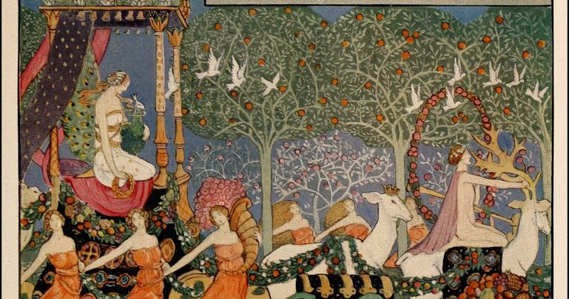 Print by Jesse Bayes
Melusine met her future husband Raymond of Poitiers in a forest. They were promptly married under one condition: he was not allowed to visit or see her on Saturdays. She would not elaborate on why but convinced him to agree. They went on to have ten children, but Raymond’s suspicions were raised by his brother, who believed that Melusine was hiding something from him and this is how he came to discover that half of her body would transform into a serpent on Saturdays.
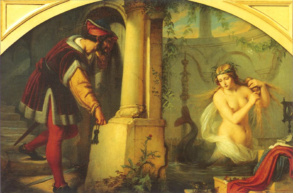 Painting by Julius Hubner
Eventually Melusine discovered that he had broken his pact and she transformed into a giant serpent and flew away, never to be seen again. You can read more about this story at the Pittsburg University Website.
Censorship vs Marketing
The Siren’s representation in all her topless splendor would draw an increasing amount of attention from a conservative public. Initially Starbucks ignored criticisms, but when it was time to place the logos on delivery trucks and outdoor advertisements, it would become an issue they could no longer ignore.
Refining the Brand
In 1987, the company was acquired by Howard Schultz and would revise the brand with a more conservative approach. The famous green color was introduced as well - a symbol of growth which would spring from the seeds of the company’s inevitable success.
By 1992 Starbucks was experiencing a vast surge in popularity and a larger cultural footprint. A new logo was introduced would enjoy the longest run for the brand thus far.
In 2011, the company revisited its brand, omitting the wordmark and outer border of the emblem. By this point Starbucks has become so recognizeable that a simple representation of the Siren in that unmistakeable green was all that was required for instant brand identification.
Starbucks remains at the forefront of its industry and their logo is an excellent illustration of how important storytelling is when it comes to building a brand or any great idea. Their success story goes to show that like all masterpieces, the best brands often look to life and art for inspiration.
Fine Print Art is an educational independent research publication. The above content has not been officially sponsored by Starbucks Corporation.