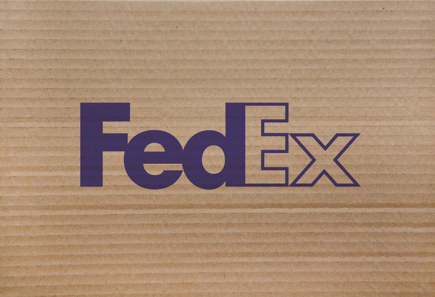
History of the FedEx Logo

With a global reputation for quality and expediency, the FedEx brand has carried a strong presence for decades. The simple efficacy of its logo has won scores of awards and is the product of effort and innovation from creative minds thinking outside the box.
The company was founded in 1971 by Frederick Smith as Federal Express. The name was intended to attract the Federal Reserve as a client. While this collaboration never materialized, the name and patriotic red white and blue color palette would endure to become a household brand all its own. The first logo was a wordmark using a custom sans-serif font with rounded edges, rotated 10 degrees inside a divided rectangle, with the word “FEDERAL” in white on blue and the word “EXPRESS” in red on white.

By 1991 Federal Express has become a household name, but at 5 syllables it’s a bit of a mouthful, so for brevity’s sake it is colloquially shortened to “FedEx” by almost everyone using the service. Sensing that it has become the defacto identifier of their brand, CEO Fred Smith agreed to abbreviate the logo accordingly. The rectangle and 10 degree rotation were removed and the same font was used to spell out “FED” in blue and “EX” in red.

Three years later, the company reached out to Landor Associates for proper rebrand. Hundreds of versions were submitted, but the winning design would be created by senior designer Lindon Leader. As a fan of stark, simple designs, he was inspired by the Northwest Orient Airlines logo, which created a subtle compass pointing northwest through the clever use of negative space carved from the “W”:

In an interview with CreativeBlog.com, Leader talks about how he helped rebrand the company:
“Customers had come to say ‘FedEx a package’ even when they were using other shippers. So the process of express shipping had become generic. We advised them that the company needed to leverage its most valuable asset, and that is the FedEx brand.”
Hundreds of designs were narrowed down to just a handful, using the same color scheme but accentuating white as the dominant color.

Leader elaborates on this creative decision:
“Each of the five candidates did pretty much what the current identity is doing. They maximised the impact of the identity, whilst also maximising the colour white. It’s on their envelopes, it’s on their vehicles, it’s on their aircraft because white is traditionally associated with Federal Express.”
With this minimalist inspiration in mind, Leader narrowed the logos down to two font choices: Univers 67 and Futura Bold. During this process he noticed a curious thing: similar to the NorthWest Airlines logo, there was an interesting bit of negative space created between the “E” and the “x”, it looked like an arrow but the symmetry was off, so he did the only logical thing and combined the fonts borrowing the “x” from Univers 67 and combining it with Futura’s “E”. This is how one of the most successful and subliminal brands of all time was created.

With the exception of the CEO and a small handful of executives, most people did not even notice the arrow. The same would prove true for millions of customers using the service. Only by highlighting the space does the hidden icon become revealed to most people.

Thanks to the success of this logo, the company would officially come to be known by their shortened nickname “FedEx” as opposed to “Federal Express”. Since then, the only other revisions have been made with color to help distinguish between the wide variety of services offered by the company. The “Fed” part of the logo remains consistent with the same purplish royal blue with Ground services assigned to green, Freight to deep red, Office to blue and Trade Networks to Yellow.

Today, FedEx remains in a class by itself when it comes to delivery services. Much like Google the brand has become a common verb with a level of familiarity that it would seem out of place to say “Send this via FedEx” as opposed to “FedEx this” in a common, vernacular style. A great deal of this success can be attributed to the quality of their services, which is reflected in the care and detail that went into creating a brand with a literal and figurative global reach.
Fine Print Art is an educational independent research publication. The above content has not been officially sponsored by Fedex Corporation.